Introduction

By Nancy Proctor

Today apps and smartphones probably come to mind first as the iconic, ground-breaking mobile platforms poised to transform the museum experience for all of us. But in fact mobile technologies have been part of the museum landscape since at least 1952 when what may have been the first audio tour was introduced at the Stedelijk Museum in Amsterdam using radio broadcast technology.[1]

Audio tours are still the most common form of “self-guided” mobile experience at cultural sites. Arguably, they are also the oldest source of “augmented reality”(AR), enabling us to “overlay” the observed environment with interpretation and other content we hear. In this light there is a pleasurable echo to finding the Stedelijk once again leading the field in AR apps, discussed here in a chapter by Margriet Schavemaker, the museum’s head of collections and research. The Stedelijk example and museums’ long history of working with mobile technologies suggests that the foundational experiences and expertise required to deploy even the most cutting-edge of 21st-century mobile technologies effectively lie at museums’ fingertips and well within their traditional purview. This introductory volume aims to help museums grasp some of the mobile skills and opportunities most immediately available to them.

Since the invention of the audio tour, the number and kind of mobile devices used by museums have proliferated. Other than audio tours loaned out on made-for-museum devices, podcasts are probably the most common mobile media being published by museums, alongside other kinds of downloadable content ranging from PDFs to eBooks and videos. In terms of personal mobile devices, the majority of the museum’s actual and potential audiences still use “dumbphones” that are limited to voice and text messaging. Hundreds if not thousands of museums have created audio tours for this low-cost platform in the past six years or so. What these forms of mobile media — the traditional audio tour, the cellphone tour, the podcast and similar downloadable content — have in common is that they are typically deployed in a broadcast delivery mode: primarily for one-way delivery of content from museum to consumer.

But with today’s new networked mobile devices — smartphones, tablet computers and Wi-Fi-enabled media players — two-way communication models are now easier and on the rise. Not just “narrowcast” audio tours but interactive mobile multimedia, including games, crowdsourcing activities, and social media, can be delivered via apps to the visitor’s own Internet-enabled phones and media players, instead of or to supplement devices provided on-site by the museum. The term “mobile” has come to encompass an ever-expanding field of platforms, players, and modes of audience engagement. Mobile today means both:

  • Pocketable (phones, personal media players, gaming devices) and portable devices (tablets and eReaders);
  • Smartphones that run apps and access the Internet, and older cellular phones that do nothing more than make voice calls and send text messages;
  • Podcasts of audio and video content, and other downloadable content, including PDFs and eBooks;
  • Mobile websites, optimized for the small screen and audiences on the go, and “desktop” websites, designed for large, fixed screens but which are increasingly visited by mobile devices; [2]
  • BYOD (bring your own device) mobile experiences, designed for visitors’ personal devices, and traditional on-site device distribution for visitors who do not have or do not care to use their own phone or media player.

Mobile’s disruptive power comes from its unique ability to offer the individual intimate, immediate and ubiquitous access combined with an unprecedented power to connect people with communities and conversations in global, social networks: mobile is both private and public, personal and political. Understanding that the new mobile devices today are also geo-spatially aware computers capable of supporting research, communication and collaboration challenges us to “think beyond the audio tour” and our silo-like approaches to digital initiatives. It also inspires us to reinvent the museum’s relationship with its many publics by conceiving content and experiences that operate across platforms and disciplines, both inside the museum and beyond.

At the same time that the rise of mobile reshapes the museum’s thinking about its digital interfaces, it broadens access to the museum exponentially. Not only are more people able to connect with the museum through their mobile devices, but there is also the potential for them to personalize their museum experience whenever and wherever they like, integrating collections, exhibitions and other offerings into a much broader range of use-case scenarios than we have ever imagined. The museum can not only enter people’s homes and classrooms, but can also be part of their daily commutes, their international travel, their work and leisure activities as never before. How will museums understand and cater to this huge range of contexts and demands for cultural content?

Mobile is Social Media

As Koven Smith has argued[3], delivering what is fundamentally the same, narrow-cast audio tour experience to shiny new gadgets is unlikely to improve the take-up or penetration rates of mobile technology used by museum visitors: in other words, to better help the museum deliver on its educational and interpretive mission. Although in conflict with visitors’ self-reported usage of mobile interpretation in museums[4], the traditional audio tour reaches a sobering minority of the museum’s on-site audiences, whether the tour is provided on made-for-museum audio devices on-site, or accessed through visitors’ personal phones or media players. In the pages that follow, Kate Haley-Goldman helps us understand this phenomenon in the context of recent major studies of mobile adoption by museums and their visitors, and frames important new questions for future research to guide ongoing developments in the field.

Thinking beyond the audio tour model, Ed Rodley provides tips on how to integrate mobile into the overall museum experience design to create more authentic, compelling and higher quality mobile programs. Jane Burton tackles the new field of “serious mobile gaming” for museums, and Margriet Schavemaker demonstrates how augmented reality can explode the museum experience into new dimensions and territories for artists, curators and exhibition designers, as well as for museum audiences. No less revolutionary is the impact of new platforms on the centuries-old docent or museum guide format: Scott Sayre, Kris Wetterlund, Sheila McGuire and Ann Isaacson describe how iPads and similar tablet computers can transform the live-guided group tour into a multi-platform, multimedia experience.

Museums are also asking how well content designed with the on-site visit in mind can fulfill the needs of those audiences who will never be able to come to the museum in person. Allegra Burnette provides an introduction to cross-platform thinking that optimizes museums’ mobile apps for both the on-site visit and beyond. Similarly, Koven Smith’s essay on the “roll-out” of mobile programs shows how new marketing approaches can be integrated into mobile project design to reach target audiences more effectively — even if the app is not built or even commissioned by the museum.

Concerns about the impact of mobile programs have always been intertwined with financial and budgetary considerations for museums. Speaking from more than a decade of experience working both in-house and with mobile vendors, Peter Samis lays out all the elements of mobile content production and their business model considerations to help museums make the best choices in the expanding field of mobile products and services. Ted Forbes guides museums through the decision-process of “native vs. web app,” and Rob Stein offers a solution for “future-proofing” mobile tours to make them more compatible across the proliferating platforms and devices now available. My own essay on mobile business models examines the new revenue streams that have entered the museum field with new mobile platforms and players in the market, and suggests metrics appropriate to measuring the success of museums’ mobile businesses.

Whether audio tour, “un-tour,” [5] “de-tour,” or “para-tour,” the approaches to museum apps described in this volume aim to go beyond the “narrow-cast” visitor services model. These essays position mobile as an integral part of a web of platforms that connect communities of interest and facilitate conversations among our audiences as well as with the museum itself: mobile is social media. As an indispensible part of the 2.0 museum, mobile supports the key indices of the museum’s success vis-à-vis its core mission and responsibility to the public good:

  • Relevance: the museum’s responsibility to make its collections, content and activities meaningful and accessible to the broadest possible audiences;
  • Quality: the museum’s mission to collect, preserve and interpret the invaluable artifacts and key stories, ideas and concepts that represent human culture and creativity;
  • Sustainability: the museum’s enduring obligation to deliver both quality and relevance to its audiences—forever.

The quality and relevance of the museum’s discourse are the preconditions for its sustainability, and enable “network effects” that grow audiences and foster self-perpetuating conversations about the museum’s collections, activities and messages. Mobile products and services do not yield these benefits on their own, but rather as an integral part of the eco-system of platforms that now make up the museum as “distributed network.” [6]

We hope these essays help strengthen the museum network and cultivate stronger connections among our colleagues as we collectively map the important new terrain of mobile in museums. Recognizing that the only constant in the mobile field is change, this publication is designed with expandability and updates in mind: the digital versions include interactive elements that the entire museum community can contribute to, including product design principles and FAQs. New essays will be added to reflect the changing body of knowledge in the mobile field, beginning with chapters on best practice in content development and collaborative production strategies from Sandy Goldberg and Alyson Webb, among others still being planned. Our strategy is to cast the net widely, tapping both veterans and new thinkers in the field, and to mine the museum community’s collective experience deeply, in order to yield the guidelines and examples that will enable us all to integrate mobile products and services most effectively and efficiently into the museum of the 21st century.


Notes

  1. Loïc Tallon
  2. A recent Pew Internet survey indicates that 40% of American adults already had access to the Internet from a mobile phone in 2010 (Smith, 2010). Gartner predicts that by 2013 mobile phones will overtake desktop computers as the most common method for accessing the Internet worldwide. (Gartner, 2010). A 2011 infographic from IBM suggests that the majority of Internet use will be from mobile devices by 2014. Sarah Kessler, IBM Infographic “Mobile by the Numbers” 23 March 2011
  3. Smith, K., “The Future of Mobile Interpretation.” In J. Trant and D. Bearman (eds). Museums and the Web 2009: Proceedings. Toronto: Archives & Museum Informatics. Published March 31, 2009. Consulted October 25, 2010.
  4. Petrie, M. and L. Tallon, “The Iphone Effect? Comparing Visitors’ and Museum Professionals’ Evolving Expectations of Mobile Interpretation Tools.” In J. Trant and D. Bearman (eds). Museums and the Web 2010: Proceedings. Toronto: Archives & Museum Informatics. Published March 31, 2010. Consulted October 25, 2010. http://www.archimuse.com/mw2010/papers/petrie/petrie.html
  5. Notes from the “Un-tour Unconference” session, Museums and the Web 2010. Consulted 15 October 2010.
  6. Proctor, N. “Mobile Social Media in the Museum as Distributed Network,” forthcoming in Interactive Museums, ed. MuseumID, London, 2011.

References:

Gartner. (2010) “Gartner Highlights Key Predictions for IT Organizations and Users in 2010 and Beyond.” January 13, 2010. Consulted January 27, 2011.

Petrie, M. and L. Tallon, “The Iphone Effect? Comparing Visitors’ and Museum Professionals’ Evolving Expectations of Mobile Interpretation Tools.” In J. Trant and D. Bearman (eds). Museums and the Web 2010: Proceedings. Toronto: Archives & Museum Informatics. Published March 31, 2010. Consulted October 25, 2010.

Proctor, N. “Mobile Social Media in the Museum as Distributed Network,” forthcoming in Interactive Museums, ed. MuseumID, London, 2011.

Proctor, N. et al. Notes from the “Un-tour Unconference” session, Museums and the Web 2010. Consulted 15 October 2010.

Smith, A. (2010) “Pew Internet & American Life: Mobile Access 2010.” July 7, 2010. Consulted January 27, 2011.

Smith, K., “The Future of Mobile Interpretation.” In J. Trant and D. Bearman (eds). Museums and the Web 2009: Proceedings. Toronto: Archives & Museum Informatics. Published March 31, 2009. Consulted October 25, 2010.

Tallon, L. “Aboutthat 1952 SedelijkMuseumaudioguide, andacertainWillemSandburg,” Musematic, May 19, 2009. Consulted January 30, 2011.

Delightfully Lost: A New Kind of Wayfinding at Kew

By Natasha Waterson and Mike Saunders

This paper was originally presented and published as part of the proceedings of Museums and the Web 2012.

1.   Introduction

The Royal Botanic Gardens, Kew was founded in 1759 and is both a botanic garden open to the public and a scientific research organisation. Since 2003, it has also been a UNESCO World Heritage Site, in recognition of its historic landscapes and architectural gems, including the largest surviving Victorian glasshouse in the world.

Just like a museum or gallery, Kew has collections—in this case dried specimens, plant artefacts, and archive documents. But it also has a living collection—its plant collection. This is the largest and most comprehensive living plant collection in the world, containing representatives of more than one in eight of all flowering plant species. Many of these species are endangered in their natural habitats, and Kew is increasingly involved in their conservation through projects such as the Millennium Seed Bank Partnership.

Through this living collection, which is publically displayed in the botanic gardens at Kew and Wakehurst Place, we aim to inspire visitors and transform their understanding of plant diversity, conservation, and our scientists’ research.

At Kew, this means helping people explore over 300 acres of outdoor space, three warm and wet glasshouses, and collections that may be above or below ground at any particular point in time! In the past, this has been a challenging, even prohibitive, environment in which to use digital technology. But mobile technologies, especially increasingly powerful visitor-owned devices, have opened up new opportunities at Kew for both wayfinding and interpretation.

To evaluate these opportunities, Kew has conducted a number of mobile trials over recent years, ranging from rented, GPS-enabled multimedia guides such as the “Kew Ranger” to experiments with visitors’ own devices, including the “Moore on your mobile” audio-guide (http://www.kew.org/henry-moore/plan/audio-guide.shtml), and a dedicated research project called “Stories at Kew” in collaboration with the BBC as part of the European Union’s “Participate” project.

waterson-fig1

Figure 1: Stories@Kew research project
Credit: BBC

Building on the need that had been demonstrated by these trials, Kew decided, in 2010, to develop a “permanent” mobile app. But even having conducted a range of trials, there were still some key outstanding questions that had not been answered: What were our visitors’ motivations and information needs? How did they move around Kew? And, given that this was to be distributed solely on visitor-owned devices, which groups had significant smart-phone ownership?

2.   Understanding motivations, needs, and behaviors

Having consolidated existing data and feedback, it was clear that visitors’ motivations were complex and dependent on a wide range of factors, many of which were independent of demographic measures such as their age or where they lived. Therefore, their behaviors would not be most usefully grouped using a typical demographic segmentation. Instead, influencing factors might include whom they visited with, why they visited, how long they had for their visit, what special exhibitions were running, what time of the year it was, and—of course—whether it was raining or sunny.

To explore this further, Kew decided to conduct a motivation-led analysis of visitors to the gardens, with the aim of correlating their expectations, motivations, needs, and behaviors. This piece of work was commissioned from a specialist firm in the field of cultural visitor attractions, Morris Hargreaves McIntyre (MHM), which had developed motivational segmentations for other attractions. In particular, their brief was to look at:

  • How visitors navigated Kew, and where they encountered problems;
  • How visitors used entrances and wayfinding materials, both when they first arrived and during their visit;
  • The perceived needs that Kew was not fulfilling in terms of wayfinding and orientation;
  • How Kew could better help visitors navigate and discover what’s on offer.

Visitors were recruited in the gardens, using screening questions to ensure that a representative sample was achieved. Research was conducted at carefully chosen sampling points around the garden. These included all of the entrance gates, major attractions and facilities, and significant route intersections around the gardens.

waterson-fig2

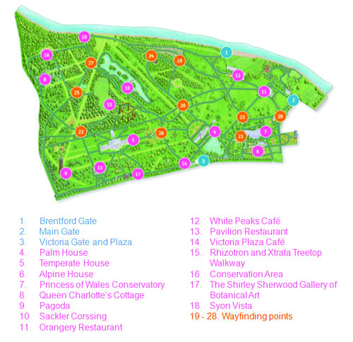
Figure 2: Sampling points of visitor-tracking observations across the gardens

The research included over 1,500 visitor-tracking observations, 350 mini-interviews, 200 detailed exit interviews, and 85 “fulfillment maps,” which tracked an entire visit.

The output of the research confirmed that although a demographic breakdown could show us who was visiting the gardens, it often did not explain why visitors came or what they needed. For example, the same person might visit as a parent on one occasion and with a friend the next time. Their motivations and needs would be completely different during these two visits.

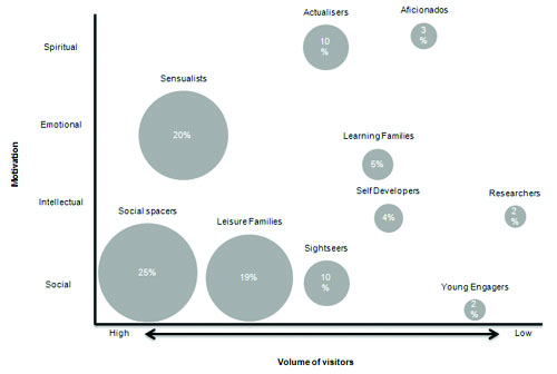
As part of the research, a motivational segmentation was developed using the responses to key questions. This divided visitors into ten groups, of which three groups accounted for 64 percent of all visitors (see also figure 3). These three groups are shown in the following table.

Motivational segment Description Needs
Social Spacers (25%) Repeat social visitors, over 35 years of age. Use facilities with family and friends. Likely to be members. Good knowledge of gardens. Ease of access, parking, comfort, orientation, good facilities, fun / engaging tours and activities.
Sensualists (20%) Retired or older audience. Use signage throughout site. Visiting to experience the beauty of nature. Unobtrusive signage, succinct interpretation, peace and quiet.
Leisure Families (19%) Socially motivated families of mixed ages. Come more than once a year with family. Little or no knowledge of subjects covered. Child-friendly facilities and activities, different levels of service to meet diverse age needs, fun activities.

Table 1: Key motivational segments at Kew Gardens

Each segment has different reasons for coming to Kew and different expectations of their visit, each of which MHM suggested were characterized by one of four fundamental types of motivation: social, intellectual, emotional, or spiritual.

As is evident from the following chart, the three largest segments, and indeed the majority of the other segments fit, into either the social or emotional motivation groups.

waterson-fig3

Figure 3: Motivational audience segments at Kew Gardens

The high proportion of people visiting Kew for social or emotional reasons had some significant implications. In particular, an assumption that many people approached their visit to Kew with an intellectual motivation (i.e., expecting to learn) appeared to be very wide of the mark.

However, there was evidence that people learnt more during their visit than they expected to—when asked at the end of their visit whether they had improved their knowledge, people were 10 percent more likely to respond that they had, compared to their expectation at the beginning of the visit.

Also of critical importance was evidence that a large majority of visitors neither see the need to plan nor actually do any planning at the beginning of their visit. Only 33 percent of visitors did any planning at an entrance to Kew, whilst 67 percent walked straight into the gardens without consulting any wayfinding or literature.

3.   Delightfully lost: the implications at Kew

The research provided several useful principles for development of a Kew app. First, it highlighted strong reasons to select particular target audiences based on a combination of their likelihood to own a smart phone, and their propensity to look for further information during their visit.

Secondly, it offered a number of design principles for the app experience:

  • Orientation should not be prescriptive: Navigation prompts are generally required “just in time” rather than at the beginning of visits;
  • Whilst motivations for visiting are predominantly to relax and enjoy Kew’s landscape with friends and family, knowledge acquisition does happen when an interest is found;
  • There are often unexpected outcomes of individuals’ visits, and this “serendipity” is viewed positively by visitors.

Together, these three design principles provided a strong steer for the way in which a mobile app could enhance people’s enjoyment of Kew, and in particular tap into their propensity to explore Kew without planning. The reasons that visitors do not want to plan initially seemed surprising, but are strongly supported by the emotional motivation of visitors. Not only do they not see the need to plan, but because their visit motivation is to escape and unwind from their structured lives, they actively reject the notion of being required to plan at Kew.

Because of the motivations of visitors to reject an imposed structure to their visit, and to focus on the joy of wandering through the landscape with their companions, the metaphor of “losing themselves in Kew” or becoming “delightfully lost” in the gardens was introduced.

On further examination, development of this idea appeared to have value not only as shorthand for a visitors’ motivations, but also as an organizing principle for the development of the app. By reconsidering the app as a tool to help people lose themselves rather than to organize a structured visit, the design brief for the app focused on moments when the visitor needs something, rather than the app itself dictating the structure of the visit.

As it was further developed, this design principle appeared to work on a number of levels:

  • It delivered the flexibility required to address the majority of visitor needs articulated in the research;
  • It created a scalable model of interaction for visitors—the app could be equally successful if it was used once or twenty times during a visit, depending on the visitor’s needs;
  • It clearly echoed the majority of visitor motivations;
  • It did not require people to spend large amounts of time looking at their phones to follow a route. Instead, they could enjoy the landscape, and their phone could become a set of tools to help them whenever and wherever they wanted to know more.

And in practice, it led to the following key app propositions being developed.

See today

An accessible set of images that capture the essence of what’s at Kew today. These include user-generated content and could feature plants, seasonal highlights, or festivals.

waterson-fig4

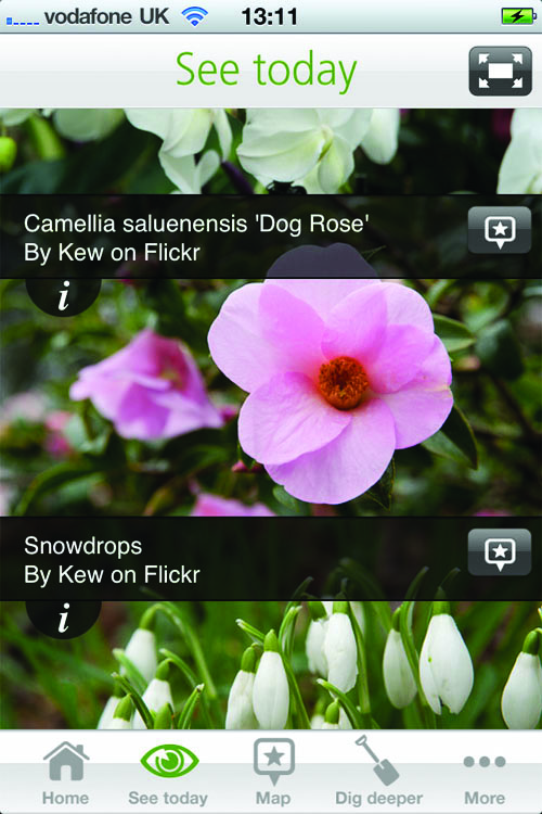
Figure 4: See Today recommendations in the Kew Gardens app

Map

Although prescriptive navigation (for example, following a route) was not popular, the ability to make decisions at key intersections is important if a decision to go somewhere specific has been made. But the map needed to be customizable so that the visitor could decide what it shows.

waterson-fig5

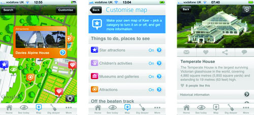
Figure 5: Map interfaces in the Kew Gardens app

Dig deeper

A set of tools to encourage people, wherever and whenever they find something of interest, to look for more that Kew has to offer.

Although all three sections of the app respond to the design ideas outlined above, the Dig Deeper section is the most interesting in illustrating the “delightfully lost” principle. It contains three individual tools that each contribute to the principle in different ways.

Firstly, the quick response (QR) code reader is a powerful trigger tool that allows the visitor to choose when and where they want to activate a greater depth of information. Around the gardens, people can scan QR codes on plant labels to activate detailed information about that species, or on interpretation panels, triggering images and video. As an initial experiment, there are over thirty codes in the Rock Garden, over eighty on trees across the site, and a selection in the Princess of Wales Conservatory, meaning that during a typical visit there will be many opportunities to use one. The aim in the future is to distribute the codes so that when someone discovers a point of interest, there is a QR code available to scan. The key is that it is individuals’ point of interest that drives the interaction.

waterson-fig6

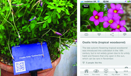
Figure 6: QR codes on garden plant labels, and the in-app screens they activate

Secondly, the augmented reality (AR) tool aims to surface information close to you as you move around the site. It is initially focused on Kew’s trees, since these cover the whole site and are of particular interest to many visitors. Using the phone’s camera, GPS, and compass, information about trees close by is superimposed onto the screen, surfacing content and information about trees that you can see around you.

waterson-fig7

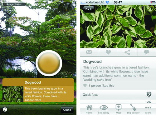
Figure 7: Augmented reality in the Dig Deeper section of the Kew Gardens app

Finally, the app includes a collection tool, which curators (experts, historians, celebrities, and even visitors) can use to present groups of items to visitors. The theme for each collection can be led by geography, season, person, or even narrative.

Together, these tools offer myriad ways to engage with everything that Kew has to offer—all of them initiated and controlled by the user, and in response to the user’s personal and contextual needs. They support visitors losing themselves physically within the landscape and virtually within Kew’s massive collections.

App marketing and promotion

Because of the research evidence that most visitors do not make decisions about their visit at the entry gate, we decided to promote the app throughout the gardens as well as at the gates. We therefore designed a range of prompts at locations which have Wi-Fi coverage and are typically “pause” spots, such as cafes. Promotion of the app was also helped significantly at launch by being showcased in the “new and noteworthy” category by the App Store.

4.   Has it worked, and what’s next?

How has the Kew Gardens app been received by visitors, and has it achieved the aims for which we set out? To answer this question, we can look at the results of a summative evaluation study, our app logs, and comments on iTunes.

Summative evaluation

In autumn 2011, Kew commissioned a summative evaluation study to gain a qualitative insight into how visitors used the app at Kew—information that would not readily drop out of logs.

Qualitative research aims

We wanted to discover how visitors used the app, and whether it delivered on its “delightfully lost” premise. Our particular research aims were to find out:

  1. In what mode visitors used the app: Did they use it as a guide, or as a means to enhance sociable, meandering exploration?
  2. Whether the app facilitated unexpected discovery, and if it did whether it capitalised on these moments in any way; e.g. by prompting discussion or exploration of deeper app content. If it didn’t, why not?
  3. Whether the app helped visitors include things in their visit that they wouldn’t otherwise have done (e.g., Kew’s hidden gems), and what happened next if it did. If it didn’t, why not?
  4. Whether there are were any other changes to the app that users thought would make it more satisfying or useful to use.
  5. Whether use of the app has any effect on the users’ likelihood to pay a return visit to the gardens.

Research methods

The research was conducted over a school holiday week, on weekdays, and at weekends. Study subjects were recruited from our main target audience groups for the app, namely:

  • Leisure and learning families
  • Sightseers.

We also included some “Social Spacers”—an audience segment made up of older repeat visitors. Both first time and repeat visitors, and members and non-members, were included in the sample. All were iPhone users who had downloaded the app and had used it in the gardens.

We ran two focus groups, one for each of the two primary audience segments, each consisting of six to eight  participants. We also conducted six accompanied visits with a follow-up interview spread across all the indentified target-audience groups.

Research findings

Technology in natural surroundings

As an introduction to the research, we asked participants what they felt about both Kew and about their iPhone—with interesting results.

In association with Kew, common words were:

  • Serene, beautiful, relaxing, tranquil, yearning
  • Discovery, trees, learning
  • Personal, family history, nostalgic, children.

In response to the phrase, “Oh iPhone…” participants’ reactions really brought home the tension between technology and nature in a landscape such as Kew.

In many respects, participants felt their iPhone was an extension of themselves:

  • “I can’t live without you”
  • “My right arm”
  • “You keep me connected”
  • “Someone close.”

They were addicted, but not without misgivings:

  • “I never wanted you, but…”
  • “Addictive, like a drug”
  • “Would be nice to be without you”
  • “Stay at home when I’m on holiday”
  • “You go to Kew to get away from the technology. It’s a last bastion.”

So while there was ambivalence about using technology in such beautiful natural surroundings, in Kew’s case our participants were so hooked on their iPhones that given an app, they would certainly use it.

User experience for beginners and experts

Not all of our target audience groups were app experts, and our study showed that familiarity with the platform had a big impact on user experience.

Younger sightseers were more iPhone expert and typically gave the app a thorough workout to see just what it could do. They were more likely to try out and appreciate the AR and Flickr functionality.

Family visitors experimented more gradually and only used a small part of the app’s capabilities. However, they were delighted with the information in the app and used it as a way to expand their experience in the gardens and provide a learning opportunity for their children.

There was also a relationship between visitors’ existing knowledge of the gardens and their expertise with the platform. This had quite major impacts on user experience, as described in Figure 8 below.

waterson-fig8

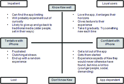
Figure 8: The interplay between knowledge of Kew and familiarity with the iPhone, and its affect on user experience

The implications of this are that we need to find a balance between providing bells and whistles for confident users, while at the same time providing an easy-to-use core functionality for the less confident. It seems we are currently doing much better at the former, and have some work to do on the latter.

The behavioural implications of technical glitches

App users were generally very positive about the idea and intention of the Kew app. However, a significant number of our study participants experienced technical difficulties associated with the download routine for app updates—an essential process to give users the latest recommendations in a seasonally changing landscape. This seemed a particular problem if visitors quickly moved away from gate arrival points (where Wi-Fi was provided) and onto a 3G signal. We suspect this was compounded by a signal black spot adjacent to the popular Palm House. There was also a bug associated with the “locate me” button on the Google-powered map, which resulted in the blue dot disappearing for a few minutes if the app had been brought from background to foreground.

Visitors were very discouraged by these technical glitches, even when associated with network conditions. They expected and wanted the app to work all the time. However, they assumed that these troubles were temporary and would be put right by Kew—possibly a reflection of their trust in the Kew brand. Such technical difficulties made visitors spend less time on the app and give up earlier than they otherwise might have done.

How did visitors use the app?

We had set out to create an app that worked with visitors’ existing behaviours: an app that wouldn’t take away from the sense of being wonderfully lost in nature, but would allow visitors to discover more, make serendipitous discoveries, and then capitalise on them. Did we achieve these aims?

Overall, visitors identified four clear roles for the app:

  • Planning advisor
  • Tempter
  • Expert companion
  • Navigator.

Tempter and expert companion both fit with our original aims. Planning advisor is a bonus, but navigator runs slightly counter to our previous research. Could it be that given an app, visitors have certain expectations of it that override its context and place?

How did the app perform in each of these visitor-identified roles?

The app did particularly well in offering ideas for pre-planning and encouraging visitors away from their habitual routes. The “See today” photos and “Off the beaten track” map listings were popular.

This was especially the case for mothers with young children. Typical quotes included:

  • “You can navigate and play and choose walks.”
  • “I can show them the badger sett which I rediscovered through the app.”
  • “It’s a bravery thing for me. I stick to my path, my daughter heads for Climbers and Creepers. It’s bravery to go off the beaten track.”
  • “I love the source of information there. Tap on the icon, where you are.”
  • “Look at what’s on today. Do this bit for a couple of hours. Don’t do it all in one go.”
  • “It gives you information on the plants. You’re not crowding in with 200 other people.”
  • “You can start at a different gate. Come in at a different gate and rediscover a grove. It’s beautiful.”
  • “You’ve got something in your hand ready for next time. It encourages you to do stuff, to prepare your visit and go to new places.”

In the role of tempter, augmented reality was a powerful and enjoyable tool, but it was not yet accurate to an acceptable standard. This made correct tree identification difficult. We had known this might be an issue prior to release, but had very much wanted to experiment with the potential of AR, so had written text to provide identification tips. However, this was clearly not enough, and suggests that although AR is certainly something worth pursuing at Kew, we should do so in ways that better tolerate the technology’s current limitations. Whether we can do this using Layar’s SDK or require bespoke development remains to be seen.

In the role of “expert companion, the app successfully deepened and enriched the experience of everyone who used it. Visitors loved to learn and understand more about plants, history, buildings, and, in particular, trees. In this regard, they wanted even more than we had provided—they wanted an explanation for anything that caught their eye! They felt the app wasn’t quite there yet on this front, but thought that this was the intent and enjoyed what was there.

This feedback clearly has implications for us—there’s a lot to catch the eye at Kew; how can we produce enough content to provide that added value and satisfy every visitor? Is there a role for the amateur expert and user-generated content? How much do visitors really want the expert voice of Kew’s horticulturalists and scientists? It’s also worth noting that this finding is counter to our original research: given an iPhone app that tempts them, visitors become information hungry.

The only role that the app did not perform well in was as a navigator. This was due to several issues, some of which were technical and others to do with the size of the device. In particular, the “blue dot” bug caused difficulties. Users also wanted compass functionality (which we have now implemented). Not many spotted the “customise” map option, which had been designed to avoid a clutter of markers. They also wanted an overview of the garden. In the future, we would like to find out more about this request, as the zoomed-out version of the map aims to provide this to some extent. It is clearly not sufficient in the eyes of visitors, however. We also suspect there is a form-factor issue at work here, which may not be resolvable on a hand-held device.

Finally, despite the map, visitors still got lost (in a bad way!) when moving from A to B. We don’t know exactly why this was, although clearly the blue-dot bug had some effect. One hypothesis is that visitors need to see readily identifiable landmarks such as street names or buildings. Another is that visitors expect to be able to plot directions on a mobile map, as they can on native mapping applications. We had excluded this functionality from the app on the grounds of project aims and budget. In any case, we would have difficulty in providing either option at Kew—landmarks are often only visible when in close proximity, and although there are paths, we encourage visitors to walk across the grass and explore.

Does the app work socially?

The app worked socially for singles and couples and for mothers with young children, but the idea of social meandering with the app was not found, in practise. People preferred to use the app to decide where to go, put it down, and then consult it again when they wanted to know something. However, we are perfectly happy with this mode of use.

Does the app trigger repeat visits?

Our study found that the app is unlikely to trigger repeat visits in its own right, but it is highly likely to exert a positive force on the decision to visit; people are able to plan beforehand, see what’s on, and find a new route to try.

App logs

While it’s tricky to assess the qualitative aspects of app usage behaviour from logs, we can see if they corroborate our summative research.

Of the map icons, Kew’s star attractions remained consistently at the top of our logs; namely the Palm House, Treetop Walkway, and Princess of Wales Conservatory. However, there were also some unexpected hits, which suggest that visitors are using the app to go off their normal routes and find new things. For example, Kew’s ice house—a small, tucked-away, underground brick building that isn’t even marked on Kew’s paper map—has never been out of the top ten. Neither has our “badger sett”—sadly not an actual badger sett, but an underground play area for children that is at the far end of the garden, which is quite difficult to find. As both are family attractions, this seems to back up our summative evaluation findings. It also confirms that mothers with small children are a key app-user group for us.

waterson-fig9

Figure 9: Kew’s ice house—an unexpected and hidden hit with users of the Kew Gardens app

Kew’s formal plantings, such as our Cherry Walk and Azalea Garden, were also unexpectedly popular, out-of-the-way attractions. These are likely to appeal to gardening enthusiasts, which is interesting in the light of our original motivations study that suggested that there was a small group of intellectually motivated older visitors who had high smart-phone ownership—our “social spacers” segment.

In the future, we will also use our logs to determine which QR codes are most scanned, and the relative importance of QR and AR in getting visitors to detailed information.

Customer ratings on iTunes

Customer ratings and comments on iTunes broadly concur with our summative evaluation study and logs. Visitors are definitely not tolerant of bugs, download problems, or other technical glitches, wherever they stem from! However, they loved the AR and the fact the app was regularly updated with seasonal content.

Is “delightfully lost” a successful design principle for Kew?

Our evaluation to date shows that “delightfully lost” is a successful design principle for Kew, as demonstrated by the popularity of the app’s augmented reality functionality, and reports that mother’s were successfully using the map to try new paths through the gardens, even though it was not prescriptive on routes.

In many respects, though, we feel that the app so far doesn’t take the possibilities of this idea far enough. Our original vision was hampered by difficulties in procurement—in our experience, the UK government’s e-tendering portal actively discourages digital agencies from tendering for work. This leaves us with further work to do, but with an evaluation study that can now guide future work.

What’s next?

Our number one priority is to improve the app experience for tentative iPhone users. This means it’s critical that we iron out app bugs and improve download routines for app updates. Feedback on the map suggests we also need to make this easier to use, probably replicating iPhone native mapping functionality as much as we can.

For our iPhone-confident users, we need to provide fun, “wow” functionality. AR is worth further experimentation, possibly with a more playful feel.

5.   Is any of this applicable elsewhere?

Knowledge of our visitors’ motivations has certainly helped Kew design a better mobile app, but what of our learning could be applied elsewhere? To answer this question, it’s helpful to look again at visitors’ wants and needs. Are there any patterns across museums, galleries, and outdoor attractions such as zoos and heritage sites?

The first challenge here is that the visitor studies’ literature describes motivational segments in a variety of ways. However, while the words vary (Moussouri, pers. comm., 2012;, Falk, 2010; Christidou, 2010; MHM, 2011; Packer and Ballantyne, 2002), some fairly consistent and common categories seem to apply. Adapted from Falk (2010):

  • Emotional and spiritual – “food for the soul”
  • Experience – “been there, done that”
  • Intellectual – professional or hobby interest
  • Facilitator – socially motivated, helping the visit of someone else in the group (e.g. child, friend on a visit)
  • Exploration – curiosity-driven, open to new ideas, want something to grab their interest.

Falk (2010) proposes that visitors can be characterized by one or a combination of these motivations. He goes on to say that knowing the prevalence of motivational segments can helpfully suggest the types of experience museums and galleries need to provide in order to best satisfy their visitors’ needs. This has been challenged on methodological grounds (Dawson and Jenson, 2011) but in our experience remains a useful model.

So what do we know about visitors’ motivations at museums, galleries, and other visitor attractions in general? Packer and Ballantyne (2002) provide three case studies in comparison: a museum covering the natural environment and cultural history, an art gallery, and an aquarium. Significant differences were found between the motivations at the three sites. In particular, visitors to the aquarium rated social interaction and “restoration” (i.e., emotional and spiritual) goals more highly, and learning and “discovery” (i.e., exploration) goals less highly than museum and art gallery visitors.

This appears consistent with Kew’s motivations study and also with a similar study carried out by MHM across Tate’s sites (Kohler, pers. comm., 2012). At Tate, intellectual motivations are prevalent amongst a much greater proportion of visitors than they are at Kew. Moussouri (2012, pers. comm.) also suggests that motivations appear to cluster according to attraction type.

How does this compare with what museums are doing on mobile platforms? Tallon’s (2011) and the American Association of Museums’ (2011) surveys of mobile technology in museums show that the predominant form of mobile content in museums is still the audio tour, that the most common objective is to provide supplementary information, and that education departments have the most influence over content. However, as the above studies show, and as Goldman (2011) succinctly notes:

Information-seeking is one of only many potential uses of an individual’s phone (compared to social utility, accessibility, status, etc.), and is not by any means the most common use (Wei and Lo, 2006). Thus visitors’ perception of their phones does not immediately indicate the phone’s usefulness as an interpretative device. Whether visitors are likely to use their phones for interpretation depends on their goals for their museum visit.

Kew’s experience undoubtedly supports this position that visitors’ motivations will vary and cluster according to attraction type, and that it is useful to design mobile experiences with these in mind. Information provision is not necessarily the most beneficial aim, and while play is another route, there are plenty of other motivations that we can tap into.

As for the question of whether “delightfully lost” might apply as an experience principle at other attractions, the evidence so far suggests it might be useful in outdoor parks, aquaria, and zoos, where planning and information-seeking are not the top priorities for visitors. However, this is said with the proviso that relevant comparative studies are relatively few to date. In the future, this may become easier—in the UK, at least—as the UK’s national museums standardize their exit surveys and include questions that will segment audiences based on motivations (Kohler, pers. comm., 2012).

6.   Acknowledgements

We would like to thank our two research agencies, Morris Hargreaves McIntyre and Susie Fisher Group, for conducting two extremely useful studies, our visitors for taking part in them, and our design and development agency Make it Clear and Make it Digital for responding to our findings. Particular thanks also to Theano Moussouri and Sabine Kohler for giving such helpful insights into their research.

7.   References

American Association of Museums. (2011). 2011 Mobile Technology Survey. Last updated November 3, 2011. Consulted February 9, 2012. Available at: http://www.aam-us.org/upload/AAM_Mobile_Technology_Survey.pdf

Christidou, D. (2010). “Re-Introducing Visitors: Thoughts and Discussion on John Falk’s Notion of Visitors’ Identity-Related Visit Motivations.” Papers from the Institute of Archaeology, 20, 111–122. Available at: http://pia-journal.co.uk/article/view/pia.344/59

Moussouri, T. (2012). Emails and telephone conversation regarding visitor motivations research. Personal communication. January 2012.

Kohler, S. (2012). Telephone conversation regarding visitor motivations research at Tate. Personal communication. February 2012.

Dawson, E., and E. Jensen. (2011). “Towards a ‘contextual turn’ in visitor studies: Evaluating visitor segmentation and identity-related motivations.” Visitor Studies, 14(2), 127–140. Available at: http://dx.doi.org/10.1080/10645578.2011.608001

Falk, J. (2010). “Calling All Spiritual Pilgrims: Identity in the Museum Experience.” Museum, January/February 2008. Available at: http://www.aam-us.org/pubs/mn/spiritual.cfm

Goldman, K.H. (2011). “Understanding Adoption of Mobile Technology in Museums.” Last updated August 5, 2011. Consulted February 9, 2012. Available at: https://mobileappsformuseums.wordpress.com/

MHM (Morris Hargreaves McIntyre). (2010). Wayfinding, orientation and arrival modes at Kew Gardens. Unpublished report.

Packer, J., and R. Ballantyne. (2002). “Motivational Factors and the Visitor Experience: A Comparison of Three Sites.” Curator: The Museum Journal, 45(3), 183–198. Available at: http://onlinelibrary.wiley.com/doi/10.1111/j.2151-6952.2002.tb00055.x/abstract

Tallon, L. (2011). Museums and Mobile Survey 2011. Last updated January 2011. Consulted February 9, 2012. Available at: http://www.museums-mobile.org/survey-2011/

Content for all kinds: Creating content that works for on- and off-site visitors

By Sandy Goldberg

Through all the seismic shifts in handheld technology in the past few years, the mantra I hear over and over again is: “Content is King.”  As a mobile content provider, it seems that I should be thrilled every time I see the primacy of content affirmed in another presentation, another blog, another article, another platform vendor website. But the problem with this mantra is that for mobile app content in particular to be effective it has to support and align with the user’s mobile experience of it. Mobile content is experience design.  What’s the experience?

Some users of mobile apps are downloading them in anticipation of a visit, to sample ahead of time what they want to see on-site. Others download to use when they get there; and then, in some cases, to use the content to explore more deeply afterwards. Of course many users pick up pre-loaded devices on site. And then there is the huge group who use mobile apps to visit museums virtually that they cannot get to in person. The word ‘visitor’ describes all of these people. How can mobile content be truly impactful for all these scenarios and contexts?

Just because we don’t know when or where the user interaction will happen doesn’t mean that content has to be completely neutral on the one hand, or completely compartmentalized on the other.

There are some widely accepted ‘best practices’ for creating audio and multimedia tours that assume an on-site experience.[i] Those best practices still apply, and I won’t go into detail about them here, but I will use some of them as jumping off points to getting to great mobile app content that works for on- and off-site museum visitors through three key guidelines, and three common pitfalls. I will also suggest some new approaches to navigation and content sharing among institutions that can radically extend the usefulness and budgets of mobile content projects.

Top Tips for Great Mobile Content Design
The most important rule for mobile content design is:

1. Start from the end, and work back to the beginning.

The ‘end’ is what actually happens between the content and the user: a.k.a. ‘user experience’ – and multiple kinds of experiences.  But first things first:

What do we mean by ‘good content’?

In 2010, as Session Chair of an online conference about mobile content for museums[ii] I polled 1,200 international participants,[iii] all museum professionals, about what they thought made good content. I presented choices that have all been longtime, accepted goals of museum interpretation. As such, I expected to find a fairly straight-line distribution of responses, and I thought that even distribution would be a way to begin discussion about balancing these goals. But I was wrong. The results were a rather dramatic bell-curve. Here’s a screen shot of the results of this live poll:

poll_results_image

It’s particularly interesting that the two least popular choices – “it offers a lot of information” and “it’s clear and concise” – described how much information was offered. I interpret this as a growing consensus against information overload on the one hand, and on the other hand a rejection of content which feels too concisely didactic, without a sense of openness or wonder about it.

You don’t know who your user is, or where your user is, but you know one thing for certain: your user is human.

On second thought it should not have been so surprising that ‘emotionally resonant’ won out in a poll in which participants voted quickly – from their gut reactions. Emotional resonance has been demonstrated to be one of the most important ways that human brains create memory. Many scientific studies have investigated the precise mechanistic link between the amygdala – the part of the brain which registers strong emotion – and the creation of memory. [iv] Indeed, one of the roles of the amygdala is now understood to be regulating memory consolidation in other brain regions.  So if we consider one of the goals of mobile content to be, on some level, to make the museum experience and interpretation memorable, then it’s self-evident that the content needs to resonate emotionally to be considered effective.

This is especially true for mobile content because the vast majority of mobile app devices are personal devices, either belonging to the users themselves, or a similar type of handheld device loaned by a museum.  The content is therefore being carried and delivered in the same way that a user gets and stores very personal information indeed. If content is downloaded onto the user’s own device, as in the case of most apps, this is particularly true. So if the content that’s accessed through a personal device is impersonal in tone, it feels off-kilter. It undermines the user experience as it is happening.

Keeping this in mind, here’s a simple litmus test when beginning to think about how to approach content about an object/display/place. The jumping-off point should not be ‘what is this?’  It should be ‘why should someone care about this?’

In other words, the second rule of thumb is:

2. Just because it’s true doesn’t mean it’s interesting.

Creating experiences: avoiding content fragmentation

Yes, you want to be able to use content on different platforms and in different configurations, and have the content work for on-and off-site visitors. But even as you are creating for ‘platform agnostic’ content, beware of producing completely isolated ‘bites’.  Fragmented blocks of content that don’t refer to each other create a disjointed, emotionally unsatisfying experience. There won’t be strong memories of the content, and there won’t be a connection felt to your exhibition or museum. To avoid this, use large ideas and themes as threads that can tie your content together no matter what the user’s path through it. Think about ideas that are seminal to your museum’s mission or collection. Take another step outwards and think about how those ideas can resonate in the larger intellectual and cultural spheres. Using large ideas will mean that no matter how your content is being encountered now or reconfigured later, the individual pieces of content will actually add up to something. This is what creates a meaningful user experience; one that resonates and is remembered.

There’s a growing consensus from the very top of the museum field that, alongside collecting and preservation, ‘experience’ is now one of the highest priority, and that mobile content is an important part of to that experience. In an interview in February 2012, Dan Monroe, President of the Association of Art Museum Directors, said “The art museum experience occurs now inside the museum, outside, online, on smart phones….  there’s more and more recognition, I think, that we’re in the business of creating experiences.”[v]

Creating content around ideas and themes can be helpful in thinking and planning ahead with your budget: in interviews, as audio or video shoots for temporary exhibitions or other time-specific uses, you can incorporate those ideas and then bank them for use in other ways. This can provide content that can live on through ideas and themes related to your permanent collection content. Through these idea threads you’ll also be creating alternate ways of navigating through your content; more on this below.

3. Use mobile content to restore what’s been lost in the museum context

Restoring authenticity

Mobile products – audio and multimedia tours, apps, games, etc. – are sometimes criticized for taking away, or distracting, from the authenticity of an onsite experience, or of a collection.  But when designed well, mobile content can restore what’s lost when objects are presented in a museum in the first place. Here are some examples of how mobile content can be used to restore lost context and authenticity:

  • Show views or details of objects that aren’t visible in the museum setting. Include the back, interior views, etc.
  • Show the context an object was made for. How would it have been originally experienced or used?
  • Describe what it feels like to hold an object. How heavy is it? What does it feel like? Show it being handled or operated.
  • Use virtual reality to bring an object’s original location or setting zooming into the present.
  • Ask for user memories associated with imagery in a work, historical objects, or displays; for example via links to social media.  This type of crowdsourcing not only provides important information; it can also help restore the collective context that inspired the maker in the first place. It also involves your audience in the creation of interpretive content, which can be hugely rewarding for visitors and the museum alike. For many users, contributing can be a truly memorable part of their experience. It creates a connection.

Common Pitfalls of Mobile Content – and How to Avoid Them 

The first of the most common pitfalls in mobile content design is perhaps also the easiest to avoid:

1. Institutional narcissism

By “institutional narcissism” I mean content about an institution’s own history, stories and staff to an extent that’s really only interesting to the people involved. It’s often found in “About the Museum” type of features, as well as content that focuses on donors and museum leadership. Other times this kind of content involves discussing objects in a way that traces the museum’s collecting history and the meaning of the objects themselves.  (See above: “Just because it’s true…”)  It’s a little bit like expecting strangers to be captivated by your family photos and mementos. This can be a particularly easy trap to fall into if you are producing your content entirely in-house.  Make sure to take a giant step backwards; include outsiders to get feedback on this sort of content at the very least.

2. Not thinking about object images

In on-site mobile contexts, many museum worry that having an image of an object on screen with audio about it tempts the viewer, in particular, younger viewers, to keep their eyes glued to their screens instead of looking at objects or displays. As a result, museums sometimes opt to put images on a separate track from audio interpretation in a mobile app or similar product. But for the off-site user, this means there’s no way to see something and hear about it at the same time. This simple mistake limits the app’s potential audience and use. One easy solution is to include an image of the object as a small, but zoomable, thumbnail.  For on-site visitors, the small image won’t be enough to distract. The first time such an image comes up, GPS detection or a popup could ask if the users are at the museum – and if they’re not, they’re told they can zoom in on the onscreen image. Other possible solutions are below, in the section on new approaches to content navigation.

3. Inappropriate use of video 

In mobile, video represents a valuable part of the ‘real estate,’ in terms of how heavy it makes the app or other audio-visual product, how much streaming is involved, and how much user attention it captures. Choose carefully what kind of content is useful for video, and, in terms of the on-site visitor, when the use of video is really called for. The most common misuse of video is a simple talking-head video, with nothing to see beyond the person sitting there and talking. Use a talking-head only if the person is inherently interesting to see (the artist of an exhibition in an interesting place, a performer in make-up etc.).  If you have a talking-head video make sure to intercut it with other images or b-roll that illuminate what the person is saying. The small screen means that the video is experienced in a one-on-one, intimate way, making extraneous commentary especially ineffective.

Also, make sure videos are the correct length if your content is ever meant to be used on-site, or in an ambulatory context. The secret to effective video (and audio) is very tight editing. Keep the length of videos to a minute or a minute and a half, maximum.  If there’s a lot to cover, edit the material into shorter videos and label them clearly with the topic in the content menu. 

Looking Forward: New Approaches to Content Navigation

In mobile, content can be what is accessed through the navigation interface, and content can also be the navigation interface.  In mobile content for a specific exhibition or building, there’s a natural tendency to create the navigation interface in a way that mirrors the physical space. That can work well for on-site visitors, whose experience will be enriched by the interaction of the content with what surrounds them.  But content navigation can also be designed from the social experience of the people using it.  If they are on-site, they could choose navigation by “I’m with someone else” from an opening menu of experiences, and this would call up content with points to suggest conversation or other social activities.

Including alternate ways to navigate the same content can also be the key to making mobile content a richer experience for pre- and post-visits, and for someone who can’t visit the museum in person.  Think about alternate navigation paths in terms of theme, according to what the user wants, or context, according to where s/he is. For example, a user could navigate the content by point of view. Do they want to investigate by the point of view of an artist, an archaeologist, or a curator for example? Content from that point of view can be tagged and grouped for easy access via a search box, menu, visual icon, or similar.  An activity tag, such as “I want to contribute” can lead to content that includes social media for activities such as crowdsourcing related to certain objects/displays, or includes museum activities or events.  This can be important for both on- and off-site visitors.

Note that these suggestions do not mean that separate content is created specifically for such alternate navigations. Instead, as you are building the content you’re thinking of these kinds of alternate uses and incorporating language/activities/etc that will work when tagged for whatever alternate navigation paths you’re including.  Thinking about this from the beginning means that alternate navigation paths through the content will feel rich and well integrated into the overall experience – and it means that they don’t necessitate extra production costs.

Another rather straightforward approach could be to use location as a determiner for streaming content.  Upon opening the app, the user is asked permission to use their location – or simply asked if they are in the museum. If the location is determined to be in/around the museum, one set of content is streamed. If the user is not in/around the museum, an alternate set of content is streamed. In some cases the content may be differentiated only slightly; for example, whether featuring fewer on-screen images of an object/display for an onsite visit, and more on-screen images, and detail views, for an off-site visit.

Looking Forward: Better Content Through Sharing

There’s been important and inspiring work done in recent years towards establishing technical standards for mobile content, spearheaded by the IMA Lab at the Indianapolis Museum of Art. In his chapter in the previous edition of this publication [vi] Robert Stein, then the leader of the IMA Lab team, describes how using technologically standardized “building blocks” of content will allow for future-proofing and sharing of platform architecture.   A further step in this discussion is the potential for sharing what goes into those building blocks.

There have been a number of digital initiatives and platforms to encourage museums to share content, ranging from image banks like AMICA[vii], founded in the early days of the internet, to contemporary video websites, notably ArtBabble[viii], and SmartHistory[ix] (now offered under the umbrella of the Khan Academy).  These are well-organized and rich repositories of art museum content, but the content on them is not generally appropriate to mobile apps.  Content that is optimized for, and appropriate to mobile apps, as we’ve seen, has distinct characteristics of length, tone, and visual readability.  A next step that could be a huge boon would be a standardized site for mobile content licensing from and among museums.

Mobile content sharing would be a way to maximize the value of the most wonderful interviews, often about subjects that are covered again and again in museum collections. This is particularly true for contemporary artists, and for themes associated with certain categories of objects that are most commonly on view in museums. We also know that a great educational tool is the compare/contrast. We can use this premise to include content about comparable types of objects in a number of museum collections – a sort of ‘conversation’ across objects. To see that an object is not the only one of its type – comparing the same type of object across collections – restores a sense of its cultural context. It also encourages closer looking.

Such sharing could be in the form of licensing mobile content, and also by producing content in a shared mode across museums.[x]  Collaboratively created content could offer a richer experience, potentially less didactic in tone in that it includes more than one point of view. Cross-institutional content makes connections and encourages visits to other museums that the user may not have known about, or thought to visit. This is also a way that museums without large production budgets can get more, and richer, production for less – since the production costs are shared across the institutions.

Content sharing brings us back, in a way, to user experience, because the jumping-off point for the user’s interaction with it is navigated through an object, or the ideas or themes it embodies. If the ‘visitor’ is not on site, then the point of departure should not necessarily be the institution. Including cross-institutional content reflects that experience – and reinforces the notion that, as museums, we are all in this together.  Better content helps us all.

Note on these last sections, titled “Looking Forward”:

I’d very much like input on these ideas from the museum community. Upon the suggestion of the volume editor, I’d like to take advantage of the initial release of this volume in digital form to collect comments to be folded into the print edition, scheduled for later in 2012. I’d love to hear about any projects that might involve some level of content production sharing, licensing between museums, and experiments with navigation according to user. It’s possible that with the number of museum apps being released that there may be some endeavors along these lines that I’m not aware of. What do you think of these ideas? Please share your experiences and opinions, and begin a conversation.  Many thanks.


[i] For the purposes of this chapter, I’m leaving aside discussion of apps built specifically for tablet devices.

[ii][ii] Museums and Mobile 2010 online conference: http://www.museums-mobile.org/

[iii] While there were 1,200 registered participants, many participants were in groups logged in via a single account; so in many cases one response represented the group’s response rather than each individual in that group.

[iv] Examples: Science Daily: How Brain Gives Special Resonance to Emotional Memories, June 10 2004: http://www.sciencedaily.com/releases/2004/06/040610081107.htm.

And Vivid memories of emotional events: The accuracy of remembered minutiae. Friderike Heurer and Daniel Reisberg, Memory & Cogintion, 1990, 18 (5), 496-506.

[v] Kenneth Baker, San Francisco Chronicle “Dan Monroe examines future of art museums”, Feb 19, 2012: http://www.sfgate.com/cgibin/article.cgi?f=/c/a/2012/02/19/PKHT1N5116.DTL

[vi] Proctor, Nancy, ed. Mobile Apps for Museums, The AAM Press 2011, Stein, Robert, “Mobile Content Strategies for Content Sharing and Long-Term Sustainability” pp 56-63.

[x] There are some notable endeavors towards sharing of app platforms: namely, The Balboa Park Collaborative, and the Smithsonian Mobile app now under development. These apps include different institutions under their respective umbrellas, but the content for each of those museums is not generally shared or cross-tagged.

Glossary

By Titus Bicknell, Nancy Proctor and Ted Forbes

app Common abbreviation for application program which refers to any body of code that performs a task or tasks when installed on a given operating system e.g. word processing, image manipulation or even a game. See web app and native app for specific uses pertaining to mobile device usage in museums.
web app Common abbreviation for web application program and also know as SaaS (Software as a Service), which refers to any body of code that performs a task or tasks when installed on a given Internet accessible server and a user interacts with it via a web browser; the key differences from an app are that it does not require installation on the user’s computer and the processing power required to execute the task(s) can be leveraged from a number of servers in the cloud; a key advantage is that the web app can be upgraded for all users by updating the central server app rather than each individual user’s locally installed copy, the key disadvantage is that the user requires an internet connection to use a web app.

N.B. in discussions of iOS and Android devices web app has come to refer also to mobile websites that are accessed through an app icon on the user’s device and feel like a native app but rely on the content and experience being delivered via the Internet.

mobile website A website optimised for access via a mobile device rather than a laptop or desktop computer; mobile websites are formatted to be viewed on a range of small screens, include minimal graphics or media elements that require significant bandwidth to download or plug-ins to display correctly to the end user; some mobile websites are designed specifically to be experienced on certain devices while others make use of different CSS sheets to delver a different layout depending on what device the web server identifies the user is visiting the site with.
native app Refers to any application program designed to be installed and run on a specific operating system; it is most commonly used to distinguish between a user experience that runs natively on a device, usually without needing access to the Internet, and a website that is formatted to feel like an app rather than a mobile website and is accessed via a app icon on the user’s mobile or portable device.
OS Common abbreviation for Operating System, the foundation layer that is installed when a device is switched on, required by all installed hardware, applications and peripherals for their individual functionality e.g Microsoft Windows 7, Mac OS X, Linux on personal computers or Apple’s iOS, Microsoft Windows Mobile, Android on mobile and portable devices.
CMS Common abbreviation for Content Management System, often deployed as a web app or SaaS to allow for collaboration among many users in creating, editing and organizing content that will be delivered via the Internet as a website, mobile website or delivered via a web app or published as part of a native app.
DAMS Common abbreviation for Digital Asset Management System, often deployed s a web app or  SaaS to allow for collaboration among many users in ingesting, tagging, and organizing digital assets. DAMS focus on secure storage of hi resolution originals that can be leveraged by a CMS in platform specific, reduced quality, alternative format instances. This dynamic relationship between DAMS and CMS minimises the number of digital versions of the same asset that need to be stored.
Device Device is a term used to describe computer hardware. Devices include computers, phones, game systems, media players and other physical electronic aides. The term “mobile” device usually refers to a hand held, portable piece of equipment such as a smartphone, smaller media player or tablet. 
Standard Refers to a set of ratified principles, coding vocabulary or mark up language used to organise and manage content, its apeparance and data structure. The adoption of standards ensures wide compatibility with devices, operating systems and applications developed by different manufacturers.
Platform Platform can refer to a) the operating system running on a specific piece of hardware (ex. Windows 7 is a platform) or b) a method of distributing content (ex. Facebook, YouTube and an iPhone app are all platforms we can use to distribute content)
Specification Sometimes a synonym for Standard but referring to a principles, coding vocabulary or mark up language that is under consideration as a standard; multiple specifications originating in different development contexts can often be aggregated to define a Standard that multiple developers can then adhere to and leverage.
HTML5 HTML is a common abbreviation for HyperText Markup Language which refers to the simple yet powerful standard that governs the writing and rendering of web pages; ratified by the W3C (World Wide Web Consortium), HTML5 is the latest iteration of the standard and adds support for the presentation and control of and interaction with audio, video and other visual assets without needing additional plugins. It is hoped HTML5 will allow the development of richer interactive content to run on mobile and portable devices with minimal processing power or ability to support plugins such as Flash.
CSS Common abbreviation for Cascading Style Sheets, a W3C ratified standard for describing the layout and appearance of content. Most commonly used in conjunction with HTML, CSS allows the look and feel of large websites to be updated from a single central style document or for web content to appear in alternative ways appropriate to different devices e.g. mobile or portable devices. CSS can also be used to define the appearance of any XML document.
XML Common abbreviation for Extensible Markup Language, a W3C ratified standard for organising data. Due to its flexibility and ability to support custom defined containers it has become a de facto standard for passing data among different incompatible applications.
Metadata Refers both to data about data and data about the framework in which that data is contained. In most cases metadata is invisible to a user during their experience of data, but is used to inform or organise the user experience e.g. metadata can be used to group results in a search by key shared metadata not explicit in the search query or metadata can be used to find associated assets in multiple CMS or DAMS in order to generate a rich media experience of a given piece of data.
API Common abbreviation for application programming interface, a set of defined parameters and interaction that allow different apps to communicate with each other e.g. Twitter API allows other apps to collect tweets, query twitter accounts or send tweets, Facebook API allows other apps to post status messages, retrieve user account information or posted images.
iOS Apple’s operating system for the iPhone and iPad; a powerful and feature rich OS, but with limited extensibility by the developer community. Apple argues the tight controls it places on iOS ensure the highest quality of user experience, others argue that the restrictions hinder development and cite open source platforms where large disparate communities collaborate to develop and optimise new functionality as a better model.
Android A mobile operating system based on Linux; although now owned by Google, Android is extensible by the vast developer community and many variants of Android have been deployed by different hardware manufacturers on mobile and portable devices such as smart phones and tablets.
Open Source Open Source software (OSS) describes any application where the source code is available freely to anyone for use and improvement. Many open source applications have attracted large dedicated communities whose cumulative improvement and extension allow for faster version release, and feature addition than many paid applications. While there is no purchase price for open source applications they are often wrongly described as free: considerable technical and staff costs may be required to make effective use of an open source application but doing so often allows for cross-institutional collaboration and cheaper customisation compared to paid apps. The museum community has made extremely good use of such Open Source applications as Drupal and WordPress.
Drupal an Open Source application widely used within the museum community as a CMS.
Moore’s Law First described by Intel co-founder Gordon E. Moore, in 1965, it indicates that the number of transistors that can be placed on an integrated circuit doubles every 24 months. The increase in processing power has in fact doubled every 18 months due to complementary developments such as parallel computing that support multi cored processors and multi threaded processing to allow for multiple processors in the same computer.
asset An asset is a piece of content in a discrete, self-contained form such as an image, a video, an audio file, or a text document.
swiping “Swiping” is a touchscreen gesture introduced by Apple with the iPhone. A lateral swipe or drag of the finger across the screen either left or right will cause a menu of content, often images, to flow by at a speed that responds to the speed of the gesture.
smartphone A “smartphone” is a phone that has Internet connectivity, enabling it to provide access to websites, apps and downloadable content. Smartphones are distinguished by simpler, often earlier, mobile phones that provide only voice calling and text messaging (SMS).
SMS Short message service or ‘text messaging’ allows messages of up to 160 characters in length to be sent or received from a cellphone.
personal media player A personal media player (PMP) is a mobile, often handheld device that plays rich media such as audio and video from local memory on the device. A common example is the iPod. PMPs may or may not have Internet access (wireless) capabilities.
hybrid app A hybrid app combines features of a native app with web-delivered content and/or web pages.
tablet computer A tablet computer or simply “tablet” is a portable digital device that consists of a screen with all computing components built behind the screen. Tablet computers do not have keyboards built-in. A common example of a tablet computer is the iPad.
eBook, eBook reader An eBook reader is a portable device designed primarily to present text such as books, magazines and article – i.e. make them readable in a digital format as “eBooks”. eBook readers often have some interactive and Internet capabilities, e.g. the ability to look up the definition of a word by tapping it on the screen, bookmark, annotate and highlight text. Some eBooks are simple PDF documents with text and images only; others may include video, audio, and more complex combinations of media.
augmented reality (AR) Augmented reality is the “real world” overlayed with digital content to create a multi-sensory experience. Audio tours have been described as the original augmented reality, since the user’s understanding or experience of a visual scene or environment can be “augmented” with audio heard at the same time. More commonly today, augmented reality is a location-based service delivered through a smartphone or tablet computer: the user views the object or scene in front of him or her through the camera on the device, and the screen shows that “real world” view overlayed with pertinent images or explanatory text. A common example of AR is found in directory apps that label the scene observed through the mobile device’s camera with further information about the buildings, e.g. restaurants, stores, in the nearby area, and may provide links to the businesses’ websites and contact details. In the cultural space, AR has been used to overlay contemporary environments with historic photos and site-specific digital artwork. AR depends on a location-based technology, e.g. GPS, to trigger the display of the correct content for the scene viewed through the user’s device.
GPS GPS stands for Global Positioning System. It is a “line-of-sight” location-based technology that uses satellites to identify and relay the user’s geo-coordinates (latitude, longitude, altitude) to his or her mobile device. GPS really only works with any degree of precision and accuracy outdoors, but because it requires a direct “line-of-sight’ from the satellite(s) to the mobile device, it can function less well outdoors if obstructed by tall buildings or foliage.
3D 3D stands for three-dimensions, and usually refers to digital models and assets that represent objects and environments in full three-dimensional form or space.
compass (in a smartphone) Many smartphones now include digital compasses that will indicate the bearing of the device as held by the user. This functionality can be used by apps run on the smartphone to perform and inform more complex spatial operations, e.g. help navigate the user through a space by recognizing not just where the user is, but also the direction in which s/he is heading.
geotag A geotag is the x, y, and z coordinates or latitude, longitude and altitude of a given location. This metadata can be associated with buildings and outdoor points of interest through a process called “geotagging”: collecting the geo-coordinates of the point and connecting them with relevant records or other content.
crowdsourcing A term popularized by Wired editor, Jeff Howe, in 2006, crowdsourcing refers to a collaboration with a broad user-base or ‘general public’ to accomplish specific tasks. A museum might “crowdsource” photographs or geodata of objects and locations of interest, for example, by building a mobile app that allows users to capture this content and add it to a common data set from their personal mobile phones. Although the “crowd” might have specialized knowledge, skills or interests, participants are not individually recruited for a crowdsourced activity; rather they volunteer their services and may even be anonymous or unknown, contributing via a platform provided by the sponsor/developer of the crowdsourcing project.
banner ad A banner ad is a horizontal advertisement that usually appears at the top or bottom of a web page. They are used in some mobile websites and apps to generate revenue and promote products and services.
mobile giving Mobile giving is a way of donating small amounts of money, usually $5 or $10, through text messaging (SMS) from a cellphone. The amount of the donation is added to the donor’s mobile phone bill.
network effects “Network effects” are used to describe systems that become more useful or intelligent the more participants, element or nodes in the system. A common example is telephones or fax machines, which become exponentially more useful, valuable, and used the more of them there are in a given networked system (i.e. a fax machine is not very useful if you don’t know anyone else who uses one, but cellphones have become prized possessions precisely because they enable connections to such a large percentage of the people on the planet). A system may also achieve network effects by mixing elements or nodes in the network: e.g. an app may become more useful, effective and used if it links to a mobile version of a museum’s website for certain features, and is in turn promoted by the museum’s traditional analog signage and promotional materials. In this example, the value of the whole system is greater than the sum of its individual parts.
onboard “Onboard” refers to the local memory of a device, e.g. an “onboard” app or audio tour is stored in the local memory of a personal media player and can be played back without the device being connected to the Internet. Onboard content stands in contrast to “streamed” content.
streaming “Streaming” refers to the download and playback of media in real time, without storing a copy of the content in the memory of the device. Unlike “onboard” content delivery, streamed content requires a constant Internet connection in order to play media. Quite often streaming is used when the content owner does not want users to be able to keep a copy of the content.
Web 1.0, Web 2.0 Web 1.0 is a shorthand to reference a style of content and experience design that was common in the early days of the Internet: also known as a “one-way” or broadcast model, Web 1.0 delivers messages to end users but does not “listen” or receive feedback from users. By contrast, Web 2.0 signifies a two-way communication model, with an exchange of content and messages between the author/broadcaster and audiences. Web 2.0 is generally heralded as a less formal, more conversational approach to digital (and other) content and experience design, soliciting audience response and partnership in the dialogue. Social media is “Web 2.0” in nature and concept.
Alternate Reality Game (ARG) Alternate Reality Games are participatory, multi-platform experiences that may use a wide range of media and tools, including websites, mobile devices, and ‘analog’ platforms in a physical space. Generally the narrative of ARGs is shaped if not largely developed by the game players and their actions and movements through space and across platforms.
social media Social media are platforms built on the Web 2.0 model that enable and encourage the co-creation and exchange of content, conversations and shared knowledge and experiences. Common examples include Facebook, Flickr, Twitter, YouTube and blogs. 
QR code A QR code is a kind of bar code that, because of its more complex design, can store more information than a traditional bar code. QR codes are read by dedicated apps that use the smartphone’s camera to decode the content ‘stored’ in the code’s pattern. This content is often a URL or website address, so upon reading the QR code the code reader app will attempt to display the web page at the given URL. Because of their higher content storage capacity, QR codes can also transmit up to several thousand alphanumeric characters, e.g. contact information or short texts.
alias/shortcut An alias or shortcut is an icon that enables one-click access to an application, program or document. It is possible, for example, to create an alias to a mobile website and store the link to it as an icon on the smartphone screen to provide more rapid access than typing in the website’s URL. Apps are also generally represented on the smartphone screen by icons that are shortcuts to start up the app.
interface An interface is a visual, graphic representation (also called a GUI or graphic user interface) that provides clickable access to content and services on a digital screen.
wireless Wireless generally refers to a network connection that does not require any ‘wires’ or cables other than, perhaps, to a power supply. Wifi and 3G are common wireless network access protocols.

Producing Mobile Content

By Alyson Webb

As a number of the contributors have highlighted, mobile is no longer constrained to a single type of experience – the audio or multimedia guide. These days it can just as easily be a game, a creative activity, a conversation. New technologies and platforms have opened up the creative potential in exciting ways and many of us are in the midst of an ongoing exploration to discover how we can get the best out of these new technologies and offer our audiences the best possible experiences.

But in our haste to get to grips with the ‘new’ it is all too easy to set aside what we already knew – to treat content as a series of functionalities or features – and lose sight of what remains unchanged: mobility. So the focus of this essay is to go back to basics and explore, through three very brief and personal case studies, what being mobile means for our content and how this understanding can help us produce great results regardless of the particular type of mobile experience. All the examples are guides but I hope to show how these experiences can inform the many new ways to use and produce for mobile platforms in our museums, galleries and historic sites and share a few basic tips and tricks along the way

A Field Somewhere in Southern England…

Some years ago as part of a script development process I as lucky enough to visit the site of the Battle of Hastings with the site’s historian.  For those of you who aren’t familiar with English history, this is perhaps the most famous battle ever fought in –England: the moment when William of Normandy defeated the Anglo Saxon King Harold.


As we walked the site, the historian talked me through each stage of the fighting as it unfolded over the course of a long day in October 1066.  He pointed out where the armies gathered and, as we walked on, I saw through his eyes, the various attacks, retreats and feints, the moments of crisis and the shifting balance of power, finally reaching the spot where, as legend has it, King Harold was struck in the eye by an arrow and died.

This is a story that, in its rudimentary form, every child in England learns and I too knew the basic facts. But nothing prepared me for the impact of hearing the story unfold on the spot where it happened and the jolt of recognition as I realised how my world and my identity had been shaped in those moments and how much had hung in the balance in that close fought battle. My government, class, language had all been transformed as a result of William’s victory. The historian had shown me why I should give a damn about this far distant moment in time and I confess I was a little overwhelmed.

The alert amongst you will have spotted that this experience was in reality just a very good live guide. No technology was involved at this stage. But it was part of a mobile production process and I think it’s worth unpacking some of the details to understand why:

Designing Content For A Locative Experience – Focusing On What Is Important In The Moment

The historian chose what he told me very carefully – he selected from a huge reserve of knowledge and told me only what would make that moment on site meaningful. He focussed on the story of the battle itself and how it unfolded because the physical and visual evidence was there in front of us. He did not give lengthy descriptions of the political context, he didn’t worry about lots of names and dates and he didn’t use jargon unnecessarily. This approach enabled me to focus on and retain a few key facts without overwhelming me, and it inspired me to learn more later on.

Considering what experience you can offer the visitor in that location that they can’t get anywhere else is a great way of identifying the focus for the content and avoiding overwhelming the user with data.

Designing Content For A Locative Experience – Using Language Choices To Acknowledge The Audience’s Experience

My guide located me in the story. How did he do this? His language was direct, personal and located: “William was stood here”, “on this spot”, “look to your left by the oak tree and we can see.” He played with time, sometimes slipping into the present tense, “The Saxons are exhausted”. He physically moved me and placed me in the heart of the action, showing me what the events looked like from the perspectives of each of the different players. His language gave the story immediacy and impact but it also acknowledged that he was there with me on the spot.

This is important for mobile content. Our devices are with us on the spot too and offer a very direct, personal experience akin to a phone conversation if it is audio content. The content needs to be created with this in mind. In other words, when a book might say “William reached the battle site…”, mobile content needs to say “William arrived here.”

Designing Content For A Locative Experience – Keeping It Visual And Sensory

The Historian not only moved me through the site but also showed me various physical features of the landscape and told me how these had played their part in the battle – how particular positions in the landscape might give an army an advantage, for example.

Looking at physical evidence – paintings, buildings, documents, landscapes – and interpreting that evidence is a core skill for historians, conservators and archaeologists. It’s not a skill that is widespread in our audiences. Helping visitors see and interpret visual (or other sensory) evidence in this way is something that mobile does exceptionally well. It should form a central part of any audio or multimedia mobile interpretation and certainly be considered as an element in other forms of mobile experience.

This isn’t just because mobile gives us an opportunity to do this – though it certainly does – but because it is a tried and tested method of helping visitors process and retain the information in a mobile context. It works best when we begin with the visual experience – “look at,” “can you see” – and then builds information, activity and meaning around that visual experience.

Start as You Mean to Go on: The Benefits of Building Mobility into the Production Process

Because many of the content formats for mobile are formats we use in other situations – video, text, images, audio, games – it is tempting to use familiar processes to create and/or select content for mobile. The problem with this approach is that it becomes all too easy to focus simply on what works on a mobile device in the literal functional sense or what we think is good for a mobile device, rather than what actually creates or supports a great mobile experience for the user.

By building mobility into your production process – e.g. trying out your content as you walk through the environments where it will be consumed – you will, naturally, consider and shape the content you create or select to enhance the mobile experience. In doing so we not only get better results but we can also reduce costs and ease processes. For example, a “walkthrough” test of a script by reading it aloud and in situ is great for those who aren’t gifted at writing for the ear or writing dialogue and don’t have access to a good writer. An edited recording of the walkthrough can even be used as the content or, if you need to bring in other voices or shape the content further, a transcript of the walkthrough can form the basis of your script.

A Modern Art Gallery in London…

I start this tale with a confession: I had not heard of the artist Nikki de St Phalle until I found myself standing in front of one of her ‘shooting’ pictures while the writer I was collaborating with talked me through the draft content. The project was one of the first ever multimedia tours and the gallery was Tate Modern. We were busy trying to design not only the content but what a multimedia experience might be. The writer had dug out video, photos, audio clips of the artist and plenty of other material. We were excited at the prospect of bringing new types of content to the visitor in the gallery and we were trying to wrangle it into a coherent experience. 

Empathy: Are You and Your Audience on the Same Wavelength?

Very quickly, I realised I couldn’t absorb a thing my colleague said. The problem was my brain was completely distracted by a very noisy dialogue. “It’s a mess.” “Are they serious? This is just what gives modern art a bad name”. The other part of my brain said, “There must be something to this. This kind of art always makes me feel so stupid: I stand in front of it and I just don’t know what to think”. With all that going on there wasn’t much room for interpretation and particularly not interpretation that started from the perspective that this was a great and interesting piece of work that I should care about.

Resonate with Your Audience

Understanding that if this was happening to me, it was probably happening to other visitors too enabled us to transform the content we produced. We created a poll and – before they experienced any interpretation – asked the multimedia tour’s users to tell us what they thought of the work. Giving them the option in the poll to privately and anonymously say what they really thought enabled us to defuse that noisy conversation in their heads. Following the poll, visitors had the opportunity to experience a range of content including videos of the artist creating a shooting picture and interpretation that put it into context. Finally we asked the visitors what they thought of the picture now having learned more about it.

Don’t Just Test The Functionality, Test The Content Design Too

The research we conducted with visitors following the launch of the project showed that they loved the poll. It gave them a sense of reassurance that their first reaction was valid, but it didn’t cut them off from shifting their view. In fact visitors wanted more: they wanted to see where they fitted within the universe of visitors – how others had responded to the poll, and what percentage agreed or disagreed with their assessment – and so we were able to develop the content and experience design further as a result.

Interactions May Change but Having Empathy with the Audience Will Always Be Necessary

A decade on, our audiences are used to having their opinions polled, and conversations via social media are a firm fixture in our lives. However, for me the point in this scenario is less about the use of interaction and more about the ways in which this empathy for the visitor can inform content design and help us find ways into a subject that take visitors with us. Because mobiles are such personal devices, content is at its most powerful and compelling at those moments when it is in tune with and responsive to the user’s experience and needs. Creating magical content is about responding to the audience and taking them on a journey.

In this particular instance it was all about starting from what the visitor might be thinking and feeling about a particular object. Equally it can be about the visual and physical impact of the environment on the visitor: that moment when they walk into a spectacular space and are blown away by it, or more practical challenges such as wayfinding. Your content – no matter what the nature of the experience – needs to take that impact and that moment and use it as part of the experience and content design.

A Street Somewhere in Soho, London…

I have worked with the National Gallery London over the course of nearly 20 years on dozens of projects and many different mobile technologies inside the gallery and beyond. It has proved an extraordinary opportunity to really think about and tease out some of the factors driving the production of good content.

Back in 2007 I was fortunate enough to work with them and the branding agency, The Partners, on a project called The Grand Tour. For this project the gallery hung full size, high quality framed reproductions of their most famous works outdoors on the walls of buildings throughout central London. Passers-by encountered such works as Caravaggio’s “Salome receiving the Head of John the Baptist” next to a sex shop in Soho, and Ingres’ “Madame de Moitessier” alongside a Covent Garden clothing store.

The museum wanted to provide engaging content that would speak to people who might not think of visiting the gallery normally. Delivering content in the street at that time meant providing content on their mobile phones via a voice call or as downloads on personal devices. It was a high profile, high impact project and we had just 4 weeks and very little in the way of budget to deliver. 

The Grand Tour is interesting for me in that it brings together some of the most common challenges I see in mobile content production: on the one hand delivering high quality content within very tight parameters (timescale, budget, platform constraints), and on the other, creating content that retains a sense of organizational identity and authenticity while being appropriate to the audience and context. Let’s look at these challenges in a little more detail.

Budget vs Quality: Cutting Your Cloth

Short deadlines and tight budgets are a pretty standard part of working life for most of us. And, in most instances where timeline or budget is just a little bit less than we would like, we get away with shaving a day off here, a little bit less spent on this or that. There reaches a point, however, when this approach begins to seriously impact quality or effectiveness. This is where we felt we were with the Grand Tour but we had one great advantage: our goal was defined in terms of effect and impact not production style.

It’s Not What You Do, It’s The Way That You Do It…

A tiny budget and little time is only a constraint if you have already defined what you are going to produce and how. Focussing on the impact you want to create and taking the broadest possible view of the resources you have to hand can be hugely liberating, particularly with mobile where there is a plethora of free or virtually free platforms at our disposal and content can take so many forms. 

For the Grand Tour project, listening to content via voice call and in the busy streets of central London meant that music and sound effects were never going to work well and licencing costs would be high. The typical approach to scripting and editing involving a writer, editor, audio engineer, multiple script drafts and sign-offs by museum staff, followed by narrators in the studio would be too time-consuming and costly. This was after all a very high profile, sensitive project and script reviews would be time consuming.

However, we had one great asset: we knew that the gallery had a community of the most extraordinarily passionate and articulate curators, conservators, educators and supporters, often artists themselves. We chose to dump the script, the music, the sound effects and almost all narration and simply focus on getting great interviews from them. We decided to review content almost completely in audio, not text, thereby saving on transcription costs. These choices around content style and production process enabled us to work fast and very cheaply saving in the region of 30% on a typical budget.

Review Resources Realistically

When designing your content be very clear about what you want to achieve, what resources you have available to you and feel free to design a style and process that fits. You’ll also need to be very tough in reviewing your resources: identifying someone who can write a script is not the same as identifying someone who can write a great script. If you don’t have access to a great writer in-house, consider hiring one or using a completely different approach, like interviews or vox pops. In other words don’t start with less than the best if you can possibly help it.

The Power of Authenticity

The Grand Tour project presented an interesting challenge: how to engage with unknown individuals who had not chosen to go to the gallery and who would be viewing the paintings completely out of their usual context. In addition, while we needed to appeal to them then and there in the street, the goal was to encourage them to come see the real thing: to transform non-gallery visitors to visitors. 

In these circumstances it is all too easy to stretch to develop an approach we think will appeal to the audience and in doing so let go of what is valuable in our own organisation. We think of this as the moment when Grandpa hits the dance floor at the wedding: t can be excruciating! The key lies in understanding what you have that is absolutely authentic to you and your organisation that will connect with the audience: where is the cross-over and relevance. It may be small but it gives you a starting point.

One of the keys for us was identifying that the shift in context – seeing the pictures in the streets, not the gallery – was a real opportunity for both interviewees and audience to look afresh at the paintings. Working with the interviewees to consider what thoughts and responses it might trigger to see, for example, a tranquil rural landscape in the heart of the city, or a scene of extreme violence beside a café – digging into the underlying value and power of the images helped us capture content that was absolutely authentic and completely fresh in tone.

Getting the Best out of your Interviewees

We then structured questions to elicit responses that would help the audience slow down and really look at and read the paintings. The interviewees would give the audience an insight into how and why the paintings affected them so deeply.

Being interviewed can be a horribly intimidating and immobilising experience. There are some real pros who can remain fluent and interesting despite the pressure of the interview situation but is not uncommon for interviewees to freeze. People who only moments before have talked in a lively and engaging fashion start to ramble incoherently. We used a few tricks to get the best out of our contributors:

All our interviews took place in front of the paintings and not in a studio – this enables most interviewees to forget the interview itself and focus on a personal conversation about an object they love. If they really struggle, feel free to lie: tell them you’ve stopped recording and encourage a chat about what they would like to cover in the interview – often they’ll relax and you’ll get a great recording (though do ‘fess up at the end!).

Unlock the passion: to become an expert you really have to work at something and you typically do that because you care, you think something is important. If you can capture their passion and opinion, your interview will come to life.

The results with the National Gallery team were extraordinary: passionate, moving, funny and irreverent, scholarly but accessible – absolutely and authentically the National Gallery at its best.

Conclusion

Having spent more than 20 years producing mobile content, I can honestly say there has never been a more exciting and challenging time to work in this medium. There are so many new types of mobile experience we can create. But sometimes, to move forward we also need to look back and understand what there is of value in the past that we can take with us into the future. By engaging with the nature of mobile and the reality of our audiences’ expectations and experiences I believe we can produce new experiences that really ‘sing’: that are pleasurable, moving and transformative. This approach will support you whether you are creating content from scratch or selecting content to re-purpose, whether you are creating a guide, a game, crowdsourcing content or conversing.

The guidelines I have offered here are just that and, as with any other creative endeavour, there is rich potential in knowingly and playfully breaking them. But here, for what its worth is a quick recap, my top ten tips for mobile content:

  • Seize the moment
  • Acknowledge your audience’s experiences
  • Acknowledge and respond to the location, visual and sensory
  • For a mobile experience make sure your content production process is mobile
  • Interactions may change but always empathize with the audience
  • Test the content: test, test, test – on the go and with actual visitors
  • Focus on the purpose of the content and design the process around this 
  • Review resources realistically
  • Ensure your tone is authentic to your organization
  • Get the best interviews you can: help your interviewees be passionate and comfortable 

Marketing The Freedom Tour: A Mobile App Case Study

By Dina Bailey, Richard Cooper and Jamie Glavic 

The National Underground Railroad Freedom Center, hereafter referred to as the Freedom Center, is a museum of conscience. It is an institution that challenges visitors to embrace their common humanity and realize the power an individual can have in advancing the cause of freedom for all people. The Freedom Center pursues this ambitious goal through stories. Storytelling, in fact, is an integral part of the Freedom Center’s mission:

We reveal stories about freedom’s heroes, from the era of the Underground Railroad to contemporary times, challenging and inspiring everyone to take courageous steps for freedom today.

The Freedom Center believes that stories have the power not only to educate, but to inspire. Stories humanize the historical perspective and bring history to life in ways facts alone cannot. The Freedom Center reveals these stories through exhibitions, programming, distance learning and tours. While storytelling has always been at the heart of the Freedom Center’s mission, for too long there was an important area in which storytelling was not reaching its full potential – the self-guided experience.

Much of the interactive, immersive storytelling that takes places within the Freedom Center happens on a guided tour with a trained docent or with historical first-person interpreters; however, the majority of these guided tours are usually reserved and scheduled by schools or pre-booked groups. (Table 1) Due to the limited number of trained docents available for guided tours beyond pre-booked groups, the majority of general visitor experiences at the Center are self-guided.

Table 1 Breakdown of Freedom Center Attendance Figures 2008 2010. 

FYO

Public

Group

School

2008

35,136

10,399

51,048

2009

42,251

5,209

45,643

2010

35,808

8,649

43,943

In 2006, recognizing the storytelling gap in the self-guided tour, leadership at the Freedom Center developed a strategic initiative focused on providing a basic audio tour to enhance the organization’s ability to provide an inspiring interpretive experience. The Freedom Center staff worked to make this happen and quickly identified an outside vendor with which to work. The resulting audio tour device, launched less than a year later, consisted of a simple, hand-held numeric keypad featuring an adult tour and a children’s tour. The device had a small speaker and a plug-in for headphones. Visitors were provided with reusable, coded floor plan maps and numeric markers were placed throughout the exhibitions to reflect tour stop stations and direct this self-guided experience throughout the permanent galleries.

While Freedom Center visitors enjoyed the audio tour experience, several factors led the institution to re-examine its commitment to the initiative. In survey after survey, visitors expressed a desire for more content: tour maps disappeared or deteriorated much too quickly and were expensive to replace at such high quality; updates to the tour were labor intensive and costly; and, most significantly, the Freedom Center wanted to have more control over its content than was possible in the contract with the original audio tour provider.

At the beginning of 2009, Freedom Center staff became increasingly more focused on exploring alternative tour engagement methods and began a SWOT (strengths, weaknesses, opportunities, and threats) analysis to determine what would be needed to create a more effective self-guided experience. (Table 2) While the cost to produce the original audio tour was manageable, the perceived benefits were lacking; the Freedom Center was given limited ability to repurpose tour content (in accordance with specifications in the contract) and it also proved cost – restrictive to create new content for the experience. The tour was only available through the provided keypad device and could not be accessed on other devices such as smartphones or via the web, meaning access to content was limited to on-site visitors. Finally, the keypad device did not have video capability, which Freedom Center leadership adamantly believed was a necessary element for the experience moving forward.

Table 2


Strengths

Weaknesses

Opportunities

Threats

Audio Tour

Storytelling Experience

Cost vs. Benefit

On-site access only

Dated Numeric Keypad

Updating content difficult

Enhance tour experience

Who really owns the content?

Mobile App Tour

Storytelling Experience

Available on multiple devices & online

Available offsite

Staff not familiar with app technology

Enhance tour experience

First museum in the city to have app specific tour

Visitation? If tour is available online will people still visit?

In January 2009, after reviewing the SWOT analysis, the Freedom Center leadership put together a Visitor Experience team with staff from Interpretative Services, Exhibitions, Finance, Education and Marketing. Budget planning and usability projections (i.e. would the visitor use their own cell phones; would the Freedom Center only provide devices that operated the new tour on internal devices) led the team to decide that the next logical step forward in the self-guided tour experience would be the development of a mobile app.

Why create a mobile app? For several reasons, really – A mobile app would allow for visitors to experience the tour throughout the museum and beyond, for the integration of video features, for content updates to be made by staff (as needed), and for surveys to be conducted quickly and effectively. Making a mobile tour app available for self-guided visitors would create a storytelling experience with enhanced content that would be far more immersive and complex than the previous keypad tour.

In March 2009, the Freedom Center selected TourSphere to develop its new mobile app. This company provides a wide range of mobile app development services to museums, tourist destinations, parks, hotels, universities, and publishers and had recently won script writing and mobile app awards from the American Alliance of Museums (AAM) and the American Association for State and Local History (AASLH), a consideration that was highly influential in the vendor selection process. Though the Freedom Center has amazing stories, if there is not a powerful script to narrate the stories, the enhancement of the visitor experience through storytelling would simply not be a successful endeavor. In addition to the importance placed on content, the Freedom Center wanted to ensure control over its content, including access to update the app at any time and portability of the media. Additionally, the future possibility of a monthly price option of $399/month fit the projected budget. Perhaps most importantly, however, TourSphere encouraged creative collaboration with the Freedom Center. Staff could opt to create the tour content alone, or TourSphere could be contracted to produce the script, video and audio pieces needed. Since the Freedom Center staff had never handled an app development project before, the team elected for creative collaboration: the staff provided the historical content and TourSphere created a script and video elements with the understanding that the Freedom Center would have final approval at the end of each developmental phase.

Marketing the Mobile App

While the simple act of creating the app was a major step forward, strategically marketing it was equally as important. With the app development underway, The Freedom Tour project team focused on a marketing plan. The objective: make the Freedom Center’s mobile tour app the premier self-guided tour in the region. In order to do this, the project team outlined the following elements as they developed their marketing plan:

  1. Overall project goals
  2. Research
  3. Audience
  4. Marketing Message
  5. Marketing Goals
  6. Marketing Methods/Strategy
  7. Measurement/Success
Photo of the ticket window at NURF, showing prices for admission and membership.

The Freedom Center included clear signage throughout the building to encourage visitors to use the mobile tour. This picture is from the ticket counter of the museum. This approach went against the normal “less” signage is better theory to help promote the mobile tour, but also to ensure the visitor was aware of the Freedom Center app.

Overall Project Goals

Why was it important to have a mobile app tour? What is in it for the visitor? What is in it for the Freedom Center? The overall project goals for The Freedom Tour were seemingly simple: enhance the visitor experience; make the visitor experience available to those who are unable to visit in-person; and use the app as a tool to spread the word about the Freedom Center and its mission. Additionally, as stated above, the app was expected to allow for the Freedom Center to update current content, create new content, and access visitor feedback through a user-friendly content management system. Most importantly, the Freedom Center would own the content on the app and would have the ability to repurpose as needed for workshops, lesson plans and other educational or promotional materials.

Research

The use of smart phones has grown exponentially since 2009, when the app was first conceived. [1]

Guided by mobile technology trends, studies and projections of the time, a mobile app seemed the next logical step in moving the tour experience forward. But, there were still questions to be answered. What would a mobile app “do” for the Freedom Center? How would those without smart phones be able to engage in the interactive tour experience? As part of the strategic process to market the app, the project team conducted interviews with several other institutions who had previously worked with (or were currently working with) TourSphere; of significance was the Edsel and Eleanor Ford House in Detroit, Michigan. The research phase also included conversations with TourSphere and other institutions regarding the operational cost and download charge for access to the app. Ultimately, the Freedom Center decided to make the App available for free. Although strongly debated on both sides, the staff came to the conclusion (based on interviews and research) that the app would not make a significant profit compared to the benefits of making the app free. This was with the understanding that in the future, the project team would most likely be asked to create another version that would be subscription/ fee based.

The project team analyzed museums across the nation to study what they offered in terms of smart phone tours, rental of devices, and cost to download the app itself. In addition to the visitor-centered analysis, the project team also looked at the cost to the organization: specifically, the maintenance of the physical devices and the software as well as the technology support that would be required, long-term. Based on this research, the Freedom Center decided to purchase 300 iPods that would be available for the general public to check out on a daily basis.  This was a significant cost even with the support from the companies involved. [2]

Audience

One major concern that the project team had was visitation; how would a mobile app, portable anywhere and full of content, affect individuals actually stepping into the museum? The initial goal of the mobile app tour was to enhance the visitor experience, not replace it. Would offering the mobile tour on multiple platforms [3] (and online) drastically affect the Freedom Center’s on-site attendance? Another concern focused on the relevance of the app to multiple target audiences. Freedom Center audience demographics are wide-ranging and diverse. With over 40,000 school children served each year, in addition to the Baby Boomers, Millennials, families, educators, academics, tourists and sports fans (the institution is located between Great American Ball Park and Paul Brown Stadium), how could the organization possibly create an app that would appeal to all of these unique audiences, market it effectively, and, at the same time, not detract from the established on-site attendance?

So, how did we do it? By explicitly demonstrating the app’s relevance to our audiences so that they understood how to get the most out of the product: for example, by making the tour experience available online, educators would be able to explore the Freedom Center before their on-site visit. The Marketing, Interpretive Services and Education departments worked together to reach out to educators to introduce them to the app. Presentations were created to show educators how the app could be used for pre- and/ or post-lessons, students could download the app for research/ class projects, and both teachers and students could be encouraged to bring their families back to use the iPods on a more in-depth, self-guided tour. The project team worked cross-departmentally to created and facilitate similar outreach models with local social media advocates, news media and other professional contacts in order to generate a general community awareness and word-of-mouth campaign.

Training Guest Services staff on app tour usability was also critical. They were the front line and initial point-of-contact for many visitors who were seeing the app tour for the very first time. Key talking points were provided, as well as step-by-step instructions, and frequently asked questions. The Guest Services staff was also coached on how to remind and encourage visitors to complete the survey that was included in the app at the end of the tour. The questions on the survey helped to better the visitor experience as well as ensure that the Freedom Center’s mission was being successfully interpreted through the use of the app.

Marketing Message

The Freedom Center utilized spaces within the building to promote the mobile app while visitors toured.  This document is similar to ones that we placed on information desks, the ticket desk, in the evaluator, and exhibits throughout the museum.

The Freedom Center utilizes spaces within the building to promote the mobile app while visitors tour. This document is similar to ones that we placed on information desks, the ticket desk, in the evaluator, and exhibits throughout the museum.

Messaging would ultimately be at the heart of The Freedom Tour launch. The message needed to be strong enough to create buzz before the launch and yet last for a long time thereafter. The Freedom Tour was a financial investment and commitment, and was expected to be a part of the Freedom Center’s interpretive plan for years to come. In preparing for the mobile app, the Freedom Tour project team began drafting messaging that would tie the importance of the content housed within the walls of the museum to the fact that the Freedom Center was truly being innovative in the city of Cincinnati. The messaging was intended to reach beyond the “We’re the first to do this” message; instead, the Freedom Center wanted to say, “We’re the best at doing this.” After much deliberation, the team agreed on the following message track:

The struggle for freedom has changed the lives of millions, and it has generated courage and sacrifice in people who have become heroes simply because of their desire to make a difference in the world, both past and present. The new iPod app tour will enhance the visitor experience at the Freedom Center, and it very well could inspire a whole new generation of “Freedom Conductors” who can make a difference for the cause of freedom.

Marketing Goals

In order to measure the app’s success, it was critical to establish goals for its use.  We decided that our primary criteria were press coverage and use of the tour both on-site and as measured by downloads of the app. In addition to benchmarks in these areas from the Freedom Center’s past audio tour system, [4] we consulted TourSphere about their staff’s experience of metrics at other institutions.  We decided to set the marketing goals for The Freedom Tour as regional and national recognition for the development of the mobile app tour as measured by press and PR activity, 60% participation by walk-up visitor traffic in the museum, and at least 5,000 downloads the first year.

Marketing Messaging/Strategy

Photo of an exhibit in the museum with an audio tour stop label.

The Freedom Center included tour signs at each location of the mobile tour. The signs helped visitors to easily locate each stop.

Once the project team felt confident in the “who, what, where, when and how,” the time for implementing the marketing strategy began. The Freedom Center needed the buy-in and support of the local community in the initial launch of the tour. This would prove challenging initially because the majority of the Freedom Center’s visitor traffic comes from outside the local Interstate-275 loop.

At this point, a bit of serendipity occurred. The launch of The Freedom Tour, originally scheduled for the beginning of January 2011, was slightly delayed, due to last minute edits and content updates. This scheduling change turned out to be a great asset to the Freedom Center. The launch ended up happening in February 2011, which coincided with Black History Month – a great win for the museum because the institution generally receives its highest level of news coverage for the entire year between Martin Luther King Jr. Day and the end of Black History Month. The Marketing Department capitalized on this opportunity and used it to their utmost advantage. At the end of January 2011, TourSphere created a promotional video specifically for the Freedom Center to distribute as a teaser to local news outlets, to be placed on the organization’s website and to be promoted to various community stakeholders. The Freedom Center also scheduled a promotional site visit with a local, beloved news anchor the week the app tour launched. Shortly thereafter, local television station Fox 19’s Frank Marzullo helped the local publicity get off to a great start with three feature stories on February 9, 2011, regarding Black History Month programming (sponsored by PNC) and the launch of the Freedom Center’s new mobile app tour. As a result of all of this free publicity, The Freedom Center received a total of 9 minutes and 42 seconds of invaluable local on-air time.

Luckily, Cincinnati is one of the most socially connected cities in the country, [5] named Most Social City by Mashable in 2011, and the Freedom Center’s marketing department was well connected to the city’s social media community. In addition to excellent TV coverage, the Freedom Center reached out to local community bloggers and social networking advocates, inviting them to try The Freedom Tour app on the now institution-owned iPods, which were available at the front desk. After taking an app-led tour of the museum for an hour, the group participated in video recorded reaction sessions – all of which were overwhelming positive. The videos were uploaded to the Freedom Center’s YouTube channel and were used in the app’s social media campaign. Additionally, Apple selected the Freedom Center app as the official iTunes “App of the Week.” All of this was just during the “launch” month of February.

Phase I of the app tour marketing launch also included updates to the Freedom Center website and related collateral materials. The Marketing Department made The Freedom Tour a highly visible part of the website itself. The information about the tour was, and continues to be, a rotating banner image on the website homepage and is featured prominently on the Visit the Center page. Visuals of the iPods are part of the visitor guide, rack card and other collateral elements as Guest Services staff welcome visitors even before they tour the museum.

In the months following the launch, Phase II marketing was essential. The Marketing Department didn’t want the app to peak during Black History Month and have awareness slowly fade away. In the first phase of the launch, the tour was only available on Apple products; but, long-range plans had been established to increase platform availability in future phases. In March 2011, local newspaper staff of Cincinnati CityBeat named The Freedom Tour the “Best Museum Tour App” in its Best of Cincinnati 2011 issue. They said:

… the app for the National Underground Railroad Freedom Center might just be the best-built overall app available to city dwellers and visitors. The app provides a full-service tour of the museum dedicated to the dismal days of slavery and the uplifting rise out of them, but it isn’t just for casual perusing on your couch. The intuitive, user-friendly app is designed to be taken with you while you tour the museum, offering audio clips about all of the displays on exhibit.

The Freedom Center received several questions regarding availability of the app on Android and other devices. The project team was able to have conversations with many of those interested in having the app on other devices and could officially guarantee that an Android version was on the way.

In addition to visitors wanting the app on various devices, the very geographic location of the Freedom Center created buzz for the tour and allowed for ample marketing opportunity. As noted, The Freedom Center is located between Great American Ball Park (home of Cincinnati Reds baseball) and Paul Brown Stadium (home of Cincinnati Bengals football). The Freedom Center purchased advertising in the home game programs for both teams with an advertisement highlighting the new tour and offering $1.00 off of general admission for adults for those who had downloaded the tour. The advertising for the Cincinnati Reds (Spring – Fall), stated that the tour would soon be available on Android and other devices. The ad for the Cincinnati Bengals (Fall – Winter), would fall into Phase III of the mobile app launch.

In September 2011, the Marketing Department implemented Phase III, and The Freedom Tour became available on Android and Blackberry devices, as well as on the web. A press release was issued and soon staff began talking directly to other institutions about the Freedom Center’s experience with creating such a unique mobile app for the institution and its successful use both inside and outside of the museum. Freedom Center staff spoke with both large and small institutions across the nation and internationally, all of whom had varying budgets, and in the Spring of 2012, project staff presented at the online Museums & Mobile conference.

Throughout 2011, the Freedom Center included the mobile app imagery and information in nearly all of its advertising, from hotel guide books to exhibition brochures, and even included a QR code at the front desk of the museum for visitors to scan and download the app directly to their phones. The accessibility of the Freedom Center tour became a part of the brand of the institution: “Fan the Flame, download the app, be inspired, make change.” The app became a part of the visitor experience organically through a strategic marketing plan focused on community involvement that used local events and Freedom Center exhibitions to highlight the app’s ingenuity and accessibility.

What We Learned

Not surprisingly, the Freedom Center mobile app project team learned quite a lot from this multi-year process. First, the importance of the client/ vendor relationship cannot be understated. The greatest product in the world can be irreparably damaged if a solid partnership is not established and maintained throughout the length of a partnership. Furthermore, without a well thought out, strategically agreed upon contract that is forward thinking and appropriately malleable, the organization can hinder its own growth and its ability to meet its stated goals over the long term.

We also learned that developing a mobile app takes time with multiple players and multiple voices. While this may seem like an obvious conclusion, it is a benchmark we often had to remind ourselves of throughout the process and are grateful that we did. With this project, the Freedom Center utilized cross-departmental collaboration that had rarely been done before (and certainly not at that depth). There were numerous logistical requirements various departments that must be addressed in synchronization so that the organization may be prepared to handle challenges as they arise. For example, at the beginning of the app launch, the tour was so popular that it crashed several of the Wi-Fi servers in the museum. During the first few weekends of the launch, there were a variety of other technical glitches that had to not only be fixed temporarily, but righted permanently. Through many conversations, the Freedom Center’s IT Department determined that the museum’s Wi-Fi network simply could not handle the demands of 300 iPods pulling data simultaneously from the network, as the initial iteration of the app required. As a result, staff installed a native version of the software with full content installed directly onto the iPods. This native app would not require the high demands of the Wi-Fi network because it would not be pulling the main content over the network. Because of the Freedom Center’s successful relationship with TourSphere, a problem was turned into an opportunity rather than one version of the app, the Center had two from which to choose: the native version, with all content included, and a “lite” version, which was smaller, but required Wi-Fi to access most media content. These two options would subsequently allow the Freedom Center’s internal devices the flexibility to run the app if there were any weaknesses in Wi-Fi within the building.

Of course, every big project comes with challenges that are harder to solve. Setting preparation and technology issues aside, the Guest Services staff was not prepared for the high volume of daily use the iPod devices received in the first year alone, 90% of walk-up visitors opted for the mobile app tour compared to 58-60% for the earlier audio tour. Expectations – even goals – had been much lower in terms of individuals who would want to check out the iPods. This is a good problem to have, but one that the Freedom Center is still managing to this day.

Staff members were also not prepared for the level to which several visitors were determined to hack into the museum-supplied iPods to browse other content, both appropriate and inappropriate. While this only happened a handful of times, the Guest Services staff now regularly checks the devices to ensure that they haven’t been hacked or password protected by rogue visitors. In the most recent Apple iOS Update (iOS6), Apple has added a feature called “Guided Access mode” which lock devices into a single app. This should significantly cut down on the individuals who are able to enter other programs while on Freedom Center iPods and staff are eager to test the effectiveness of this feature.

Conclusion

Mobile apps are the wave of the future. Mobile apps are informative. Mobile apps are social. Mobile apps provide access on-the-go. Mobile apps are everywhere. According to Pew Internet, a project of the Pew Research Center, 83% of Americans own a cell phone and 45% of Americans have a smart phone. [6] The Freedom Center app far exceeded the institution’s visitor usage and download goals. The Freedom Tour has been downloaded over 40,000 times, [7] in 40 different countries, on 6 different continents. And, on average, 95% of Freedom Center on-site visitors select to take the provided iPod devices. The leadership views the use of mobile technology and apps as a crucial part of the institution’s interpretive plan, but still realizes that good interpretation will always be key: technology and apps should only be used as a vehicle to bring great stories to life.

While downloads have inevitably slowed down slightly since the launch of the app, the Freedom Center continues to brainstorm new ways to promote The Freedom Tour in conjunction with exhibitions, programming and educational marketing. The app has been updated several times to include interpretation for changing exhibitions and to reflect the standard updates made to the Freedom Center’s permanent galleries. It is the hope that future updates will continue to make the app more interactive by including activities for visitors to participate in, possibly adding a mobile game, crowd-sourcing opportunities or a visitor wiki. As the Freedom Center continues to lead mobile app innovation in the future, we hope that we challenge and inspire other institutions (both large and small) to take courageous steps and tell their stories in a new way!

End Notes

  1. Quick, C. (2009, September 15). With Smartphone Adoption on the Rise, Opportunity for Marketers is Calling. Nielsen. Retrieved from http://blog.nielsen.com/nielsenwire/online_mobile/with-smartphone-adoption-on-the-rise-opportunity-for-marketers-is-calling/
  2. For the number of daily visitors that the Freedom Center has, 300 iPods were deemed to be in the “safe” range for providing a quality visitor experience (i.e. having enough iPods available) while balancing insurance and maintenance costs.
  3. As a mobile web app, the tour is supported by a wide range of platforms: Android, Blackberry, iPhones, tablets, and the mobile web.
  4. The participation rate for the past audio tour system ranged between 58 to 60% for walk-up visitors.
  5. Stark, C. (2011, June 28). Cincinnati Takes Most Social City Title for Mashable’s Social Media Day. Mashable. Retrieved from http://mashable.com/2011/06/28/cincinnati-most-social-mashable-smday/
  6. Brenner, J. (2012, September 14). Commentary: Mobile. Pew Internet. Retrieved from http://pewinternet.org/Commentary/2012/February/Pew-Internet-Mobile.aspx
  7. 40,303 Apple downloads and 461 Android downloads.

Enhancing Group Tours with the iPad: 2012 Updates and Discoveries

By Ann Isaacson, Laura Krueger, Sheila McGuire, Scott Sayre and Kris Wetterlund

See also the 2011 essay, Enhancing Group Tours with the iPad: A Case Study

Building a Community of iPad Users

One of the most rewarding outcomes of introducing iPads into the Minneapolis Institute of Art’s tour programs is the way in which guides are coming together to share content in formal and informal settings.

Inspired by the desire for specific images and videos for special exhibition tours, small groups of guides are collectively creating contextual material for their distinct tour needs. Each person in the group takes a topic or object to research and build content around. They then meet in person, email, or post information on the museum guide Web site forum to share their findings with each other and museum staff. The guides are also sharing how and when they are using the iPads and reflecting on successes and drawbacks while touring.

Generally, the guides most likely to organize these small iPad communities are those that have recently completed their training. The museum provided them access to iPads, instruction on how to use them, and encouragement to experiment with iPads from the start. A small group of these guides meets once a month outside of the museum to share content, information and presentation tips. Most guides now own their own iPads. In addition to sharing content, one member wrote that they are, “sharing the insights that we have all gained attempting to use this technology in a convenient, supportive environment.” Taking it yet another step, this group plans to further their technical skills by scheduling a follow-up session with instructors at the Apple store.

A few guides are exploring various methods to both share and manage content folios, such as the museum guide Web site forum mentioned earlier. Most guides prepare their tours at home and this method of sharing can provide them the opportunity to familiarize themselves with the content before their tours. The interest amongst guides to build, manage and share contextual resources is an exciting step towards expanding the use of iPads on museum tours.

An iPad of Their Own

The optimism surrounding the tour guides sharing content in an unprecedented scale has also ushered in the reality that many prefer to use their own iPads.  The “I am more comfortable using my own” phenomenon is understandable given an individual can organize content in the way that makes sense to her, on her own schedule, and, in many cases, with the assistance of trusted family or friends.  Although more tech savvy guides organize information on personal Web sites, most are adding photos on an as-needed, per-tour basis to the Photos app that came with the iPad. They can search for and locate an image on the Web, simply tap it a couple of times to add it to the Photos app in the order they want it, and easily access it during their tour without the anxiety of searching through the many dozens of folders on the iPads supplied by the museum. It makes sense.

Museum staff is taking steps to make using the on-site iPads easier for more volunteers. Recognizing that many people will gain confidence with the iPad only by having time to experiment and explore on their own time, the museum now allows the tour guides to check out the devices overnight. As more iPads are added to the fleet, the guides will be able to borrow them for extended periods of time. The hub computer is now in a more accessible area in the tour guide’s study to facilitate peer-to-peer learning and sharing.  A docking station will eliminate the onerous task of individually syncing all of the iPads. The hope is that these changes will make it easier for tour guides to add content to the shared iPads as well as their own.

Roving iPads

Interviews with tour guides showed that while they felt the iPad was useful for web-based research many felt that performing spur of the moment searches during their formal tours to be too complicated, disruptive, and time-consuming. However, the same guides were interested in exploring additional applications of the iPad to serve visitors’ learning needs and to answer their questions when looking beyond tours. Some of the tour guides expressed future interest in having museum volunteers with iPads positioned in the galleries to answer visitors’ questions. These roving guides could engage visitors in conversation and use the iPad to look up information relevant to the visitors’ questions. While the Minneapolis Institute of Arts currently does not have full-time gallery-based interpreters, the museum’s building-wide WiFi can provide limitless opportunities to experiment with this technique. The Columbus Museum of Art is exploring iPad use with their roaming docents who are in the museum galleries in the afternoons, answering questions, directing visitors, striking up casual conversations and telling stories.

A Post Tour Digital E-Souvenir

Many of the digital assets used on iPads by tour guides are generated by the museum for print publications and online access. And while many tour guides will mention that some or all of the resources they show in their tour can be found on the museum’s Web site, there is a great opportunity for providing a more formal summary/souvenir of the object and topics covered in a tour. Recent development in ebook publishing such as Apple’s iBook Author will provide new opportunities to produce free or low-cost e-souvenirs directly tying the resources related to a tour to an extended post-visit experience. Tour guides offering iPad enhanced tours could conclude the tour by showing a preview of a related e-souvenir book and either collecting email addresses or providing a URL where the publication can be accessed. These e-souvenirs offer a great deal of future potential as collectables and launching points to both online tour related content and other commercial electronic and print-based publications.

More Museums Adopt iPad Tours

Since this article was first published a number of other museums have adopted iPads as multimedia touring devices. While the guides at the Minneapolis Institute of Arts have been sharing tips, techniques and content around their use of iPads, the Museum of Modern Art’s in gallery educators have followed suit. MoMA staff posts challenges for their gallery educators each month, and one month recently the educators were challenged to use iPads on tours and share their results via a blog on MoMA’s internal educator network. The discussion confirmed findings by MIA tour guides that one of the most powerful features of the iPad is the ability to zoom into images. MoMA educators discussed a successful game in which details of painting were shown on the iPad, and the tour group guessed which part of the painting was shown based on close examination of the painting in the gallery. Other successes included showing works of art related to MoMA’s but that were not in MoMA’s collection. Gallery educators also confirmed that the speaker on the iPad 2 was adequate for groups in MoMA’s galleries.

The Kalamazoo Institute of Arts education department purchased iPads for use with visually impaired visitors. The museum provides touch art tours of 3D objects for individuals with visual impairments but wanted to expand the tours to include paintings and works on paper. The iPads allow visitors with visual impairments to zoom in on details while the docent is providing a verbal description of the work. The museum’s advisory committee includes many experts in the field of low vision and blindness studies who recommended iPads.  Pearl Rosen Golden, an Access Consultant, concurred with Kalamazoo’s ideas, pointing out that even labels and text panels can be increased to a comfortable viewing size for visually impaired visitors, and screen light intensity can be controlled. In the future, Rosen Golden imagines, museums will provide tour images that can be downloaded and visually impaired visitors can come prepared with their own iPads ready for the tour, ushering in a new world of access for the visually impaired visitor.

Mobile Product Development Principles

By Nancy Proctor

  • Mobile products should be accessible and used to enable access to experiences and resources for people of all abilities.
  • Mobile projects should expand and create new opportunities for engagement, not seek to reproduce existing ones on mobile devices.
  • Mobile should be understood as social media and projects should leverage its ability to create conversations, communities, and collaborations both alone and in combination with other platforms.
  • Wherever possible, a mobile website should be at the core of every mobile application project to enable multi-platform accessibility.
  • Digital content should be conceived for cross-platform use and re-use according to mobile content standards with quality metadata.
  • Avoid writing new and/or dedicated code, or using proprietary or dedicated systems.
  • Make code, tools, best practices and other learnings from mobile projects freely available to others to reuse.
  • For quality and consistency of user experience, mobile initiatives should use standard interfaces.
  • Embed metrics and analytic tools in every mobile product, and include audience research and product evaluation in every mobile project to inform iterative development and ensure quality.
  • Every mobile project or product must include a commercial or other plan for its sustainability and maintenance

Enhancing Group Tours with the iPad: A Case Study

By Ann Isaacson, Sheila McGuire, Scott Sayre and Kris Wetterlund

See also Enhancing Group Tours with the iPad: 2012 Updates and Discoveries

Introduction
The Minneapolis Institute of Arts is an encyclopedic art museum with a permanent collection of around 80,000 objects. Currently, 385 volunteer tour guides in the museum’s Department of Museum Guide Programs interpret these collections for over 140,000 visitors annually, helping fulfill the museum’s mission to make the collection accessible to the community.

Digital media has been a long-time friend of the early-adopting Minneapolis Institute of Arts and its visitors. It started with the installation of gallery-based kiosks in the early 90s, then an early handheld tour in 1997 (using Apple’s Newton), cell phone tours in 2001, and a tour app in 2010 (Sayre, 1993, 2005, 2007). While all of these technologies were designed with the visitor in mind, the museum’s innovative tour guides have found ways over the years of incorporating components of these programs into their tours. For example, tour guides frequently gather their groups around gallery kiosks to show videos.

Interest in media integration was rekindled during a 2008 Symposium session on integrating digital media into tours. Tour guides passed around an iPhone playing a video of artist Dale Chihuly creating a chandelier identical to one in the lobby at the Minneapolis Institute of Arts. The tour guides were “ignited,” remembers one participant, about the possibilities of presenting dynamic media literally in the palm of their hands. Contrary to popular trends, the tour guides’ excitement was not about handheld technology itself, but the potential of presenting portable media on tours to enhance visitors’ understanding of works of art.

Following up on the potential of this experience, Wetterlund and Sayre began to explore the possibility of mobile social computing, in particular the human-guide-mediated experience (Sayre, Wetterlund, 2008). After reading their article on social computing, the MIA contacted Sayre and Wetterlund about the integration of portable media in their tour guide program. The museum understood what visitor research has shown: the majority of visitors come to the museum in groups (Draper, 1984) (Sachatello-Sawyer et al., 2002). The announcement and release of Apple’s iPad was timely in the delivery of a user-friendly solution.

Research
With the right computer in place, a research project was developed to explore the feasibility of enhancing group tours with a range of rich media delivered via a single iPad, used as a group presentation device. The project defined three primary areas to explore.

Response:

  • Visitor response
  • Tour Guide response
  • Museum educator response
  • Museum-wide response

Obstacles:

  • Political and psychological obstacles
  • Physical obstacles
  • Technical obstacles

Logistics:

  •  Training needs
  •  Material preparation and organization
  •  Most effective materials
  •  Hardware management

Instruments
The research team developed three instruments to assist in the collection of data:

  1. Observer checklist and comment document
  2. Pre-training survey
  3. Post-training survey

Project Phases
The project research was divided into five phases:

  1. Media and App Selection
  2. Trial Tours and Observation
  3. Resulting Strategies
  4. Tour Guide Training
  5. Survey Results

1. Media and App Selection
Early on in the process, the educators sent an e-mail inquiry to all of the museum’s volunteers. This yielded an abundance of creative ideas about enhancing tours with multimedia, and a healthy dose of concern that the technology might distract from the artworks. The most popular responses included a desire to have world maps, music, pictures and diagrams, and videos of art processes, dance, artists, etc. The team collected a range of media set up on a PC to serve as a hub device from which all of the iPads could be synchronized.

The team also investigated apps for organizing, navigating and presenting the various assets on the iPad itself. In the end there was no one app that could manage all forms of media. The team settled on managing audio and video as playlists within the iPod app, images in the Photos app, and the Safari and Google Maps apps for bookmarked locations. Important aspects of an iPad file management app for tour guides include:

  1. Integration and linear (swiping) presentation of all forms of media, in both landscape and portrait mode.
  2. Integration with iPads’ onboard media assets managed on the computer to which the iPads are synced.
  3. Ability to organize assets on the iPad based on tour type, subject or tour guide.
  4. Light table and search capabilities.
  5. Ability to create multiple shortcut “aliases” to the same onboard media asset in two more locations, so that the assets themselves do not need to be duplicated.
  6. Ability to add metadata to media so it can be easily queried.

2. Trial Tours and Observation
Several tour guides volunteered to try the iPad with tour groups, accompanied by a staff evaluator who used the observation checklist to record events on 20 tours. The tool was designed to gauge the effectiveness of the iPad based on the engagement of the visitors. The observation tool assessed:

  • the portability and presentation strategies for the iPad;
  • whether the tour guide was able to successfully navigate the different types of content on the iPad;
  • whether the content selected for presentation was integrated appropriately into the topic of the tour;
  • whether the quality of the content (audio, video, etc.) was adequate for the tour group;
  • whether all visitors on the tour were fully engaged with the iPad content when it was presented.

Portability of the iPad was not an issue. In some cases, the iPad was a relief, as it took the place of larger, bulkier props.

In all cases, the tour guides successfully navigated the content on the iPad, easily locating different types of pre-loaded content, easily adjusting the image brightness and volume. The screen size, brightness, audio level and quality, and video and image quality were rated excellent to good.

Most important, all of the museum visitors were engaged during the iPad portion of the tour. All visitors indicated understanding how the iPad content related to the tour content, and all thought it added to their understanding of the works of art. Visitors responded to short videos illustrating artistic processes or techniques with an audible “ah ha!”

3. Resulting Strategies
The initial rounds of in-gallery testing yielded a number of useful strategies. Like any gallery prop, digital media should be used judiciously to avoid making it the focal point of the tour. For example, while facilitating a discussion on a Lakota beaded dress, a video demonstration of beading technique could be introduced: “Now that you’ve had a chance to see the fine detail on this Lakota dress, let me show you a video demonstrating how those perfect rows of beads are sewn onto the hide.” Explaining any kind of prop, traditional or multimedia, by cluing visitors on what they are about to see and explaining what they are likely to get out of the prop is good educational practice.

Holding the iPad so that the screen faces away from the visitors while searching for information relieves them of the burden of having to watch while the tour guide taps around the screen. A thoughtful, open-ended question can momentarily turn the focus away from the mechanics of locating information on the iPad.

Displaying media on the iPad about shoulder to chest high seems most effective. When not in use, darkening the screen avoids diverting attention away from the tour presentation. Video or audio is best kept short, between 30 to 60 seconds. While the iPad’s speakers are remarkably good, hearing audio or video in a crowded gallery can be problematic, especially for larger groups. Tour groups at the MIA typically range from 10 to 15 people. MIA tour guides solved this problem with larger groups by turning the sound off and narrating the video themselves.

4. Tour Guide Training
To take advantage of Apple expertise and hardware, a training for MIA tour guides was offered at a local Apple store to introduce the iPad as a hardware device, and help the tour guides understand how to navigate the interface. The Apple business team was excited to learn about the MIA project, and over 50 tour guides attended these sessions.

The next training sessions were held at the MIA. Nearly 100 tour guides and Apple Store business team employees attended these sessions, where the goal was to make it clear how to access content organized on the iPad, and to model the strategies discovered in the trial tours for presenting multimedia on the iPad.

In addition, tour guides went over the procedure for scheduling and checking out the iPads from the office, as well as the docking procedure when the iPads are not being used.

5. Survey Results
An online pre-training survey was distributed to all tour guides interested in iPad tour training. The survey collected information about the tour guides’ experience with the museum, technology, and their preconceptions about using the iPad in public tours.

Key findings showed (N = 97)

  • The majority of the respondents had over 10 years experience as guides.
  • 47% had previously integrated gallery media content into their tours.
  • 74% considered themselves to be experienced computer users (69% PC).
  • 30% owned smartphones.
  • 62% had never used an iPad.
  • 20% had attended the previous iPad device training, and 80% felt it was helpful.
  • 90% who attended the iPad device training were interested in using the iPad in tours, with the remaining 10% unsure.
  • Preconceived advantages of using the iPad in tours
    • Images/Zooming: 47%, Looking up information: 18%, Video: 16%, Maps: 13%, Music/Sound: 8%
  • Preconceived concerns related to using the iPad in tours
    • Overuse/distracting: 37%, Nervous/Performance: 37%, Image too small for large groups: 16%, Gallery noise: 3%

An online survey was conducted approximately 30 days after the iPad tour training. Post training survey participants (N = 49) were correlated against pre-survey participants according to their email addresses, resulting in a total of 38 (10% of the total volunteer group) who participated in both surveys.

Key findings showed (N = 38)

  • 66% had used an iPad since training.
  • 8% had purchased an iPad since training.
  • 24% planned to buy an iPad.
  • 21% (8) had given one or more tours using the iPad.
  • 63% of those who attended the tour training were planning on using the iPad in their tours, with another 34% unsure.
  • 91% of the trainees who attended both the iPad device and iPad tour training were planning on using the iPad in their tours.
  • 26% felt they could benefit from more training, with 42% unsure.
    • Suggestions included mentoring, practice sessions, tour guide group presentations
  • 39% felt they could benefit from more support, with 34% unsure.
    • Suggestions included loading and locating content, work process and identifying gallery objects with additional content.
  • Preconceived concerns related to using the iPad in tours:
    • Overuse/distracting: 21%, Image too small for large groups: 21%, Nervous/performance:16%, Taking too much time: 8%, Gallery noise: 5%, Fragility/breaking: 5%

The key conclusion from the surveys was the effectiveness of combining the iPad device training with the iPad tour training. Tour guides who participated in both training sessions demonstrated a much greater degree of confidence in using the device and integrating it in their tours.

Discoveries
The iPad tour project has encouraged staff throughout to think of new content to integrate into the program. MIA photo services staff suggested additional “hidden” details to include, and MIA curators brainstormed an array of exciting possibilities. They also look forward to using the iPad to share whole print series, complete ledger books, and other resources that cannot be viewed in the galleries.

The PC hub computer has become a community repository for content as staff and tour guides are able to contribute music, videos, and photos. Everyone using the iPads has access to the materials contributed by their colleagues. Also, the volunteers who are excited about the media that can be integrated into tours with the iPad are the most powerful advocates for getting their peers engaged in the process. The media content on the iPads has inspired tour guides to include objects on their tours that that they would not have considered before.

Another welcome outgrowth of this initiative is that visitors become active participants in the creation of the digital stories being told during the tour. For example, on a recent tour a visitor made a connection between a terracotta portrait head from the Ife Kingdom and the ancient Egyptian queen Nefertiti, but was unable to relate the two chronologically. A search on the iPad put Nefertiti’s dates and images at the tour guide’s fingertips, contributing a whole other level of user-inspired content to the discussion and validating the visitor’s contribution.

In the early planning for this project, the team was most excited about the possibilities for video on the iPad. In practice, however, pictures on the iPad prove the most powerful. Visitors are delighted when a small object encased in Plexiglas in a dark gallery appears on the iPad, and the tour guide zooms in to show the details.

Photographs of things that are not possible to see in the galleries are also riveting for visitors. Detailed photos of the engine of a car when the hood is closed in the gallery, an embroidered chest with all of its drawers open, or the underside of a vessel all have visitors studying both the object on view and the iPad intently.

Challenges
For a decade and a half, tour guides have expressed concerns that the museum might want to replace them with technology. But in the end, especially with the integration of technology into their tours, tour guides are assured that people want human interaction. Far more visitors interact with tour guides annually than take advantage of audio tours. Peter Samis has it right when he describes humans as the “ultimate interactive device,” context sensitive, and responsive to questions in real time. (2007)

Some of the challenges the project team encountered are more obvious: iPads are expensive, many volunteers are inexperienced with or fearful of the technology, and managing a lot of media files can be cumbersome and intimidating, especially in front of a group. The greatest technical challenge on tours has been the volume of the iPad when the galleries are full or the group is very large. A case with built-in speakers would be an ideal solution.

The Future
Challenges aside, the enthusiastic response from all of the stakeholders has set a course for continuation and expansion of the iPad program at the MIA. The MIA is currently using Apple products in its tour guide programming, but other tablet computers are coming to market that will likely offer similar potential and perhaps even more possibilities.

New hardware features like the iPad2’s cameras will make it possible to experiment with bringing voices outside of the museum into tours in real time. In the future, tour guides might engage visitors in conversations with artists in their studios, or with children in museums in other parts of the country. The cameras can also be used to capture QR codes from museum labels to help tour guides quickly access related content.

New technology like Apple’s Airplay allows tour guides to send media stored on an iPhone or iPad wirelessly to a larger dedicated or multipurpose monitor or projector connected to AppleTV for group presentation. New apps for better managing, organizing and presenting all forms of media content on the iPad continue to be released and assessed. Recent prospects include Best Album, which provides tools for organizing, cataloging, searching images, video and audio within personalized albums.

And finally, once existing media has been mined for its potential, the logical next step for museums is to undertake the production of new media assets specifically for use in iPad-enhanced tours.

Interpretive techniques are expanded when considering the potential of presenting multimedia on tours. Hopefully other museums will embrace these opportunities and help foster a new era in museum tour experiences.


References

Draper, L. (1984). Friendship and the museum experience: The interrelationship of social ties and learning. Unpublished doctoral dissertation, University of California, Berkeley.

Samis, P. (2007), “New Technologies as a Part of a Comprehensive Interpretive Plan” in The Digital Museum: A Think Guide, Din, Herminia and Phyllis Hecht, eds., Washington, DC: The AAM Press, American Association of Museums, 2007.

Sayre, S. & Wetterlund, K. (2008) ”The Social Life of Technology for Museum Visitors,” Visual Art Research Journal, Pennsylvania State University.

Sayre, S. & Dowden, R. (2007), “The Whole World in Their Hands: The Promise and Peril of Visitor Provided Mobile Devices” in The Digital Museum: A Think Guide, Din, Herminia and Phyllis Hecht, eds., Washington, DC: The AAM Press, American Association of Museums, 2007.

Sayre, S. (2005), “Multimedia that Matters: Gallery-based Technology and the Museum Visitor,” First Monday, Peer-Reviewed Journal on the Internet 10, #5

Sayre, S. (1993). “The Evolution of Interactive Interpretive Media: A Report on Discovery and Progress at the Minneapolis Institute of Arts” in Diane Lees, ed., Museums and Interactive Multimedia: Proceedings of the Sixth International Conference of the MDA and the Second International Conference on Hypermedia and Interactivity in Museums, Museum Documentation Association and Archives and Museum Informatics.

Sachatello-Sawyer, B., Fellenz, R., Burton, H., Gittings-Carlson, L., Lewis-Mahony, J., & Woolbaugh, W. Adult Museum Programs: Designing Meaningful Experiences. Walnut Creek, CA: AltaMira Press, 2002.

Mobile Experience Design: What’s Your Roll-Out Strategy?

By Koven Smith

Rapid advancements in smartphone technology of the last few years have changed the nature of mobile experiences in museums utterly. Where tour-based audio guides were once the only type of mobile experience available to museum visitors, we are currently witnessing an explosion in the types of experiences from which visitors might choose. Augmented reality games, crowd-sourced content creation, or even experiences not designed to occur inside the museum at all are just a few of the new ways that museums are beginning to explore to enhance either a physical or virtual visit.

These new opportunities mean that museums must now take a more nuanced approach to how their mobile experiences are introduced to the public. In the past, the expense of providing mobile experiences to visitors (typically via audio) meant that those experiences needed to appeal to the broadest possible audience in order to make them cost-effective. This broad appeal was reflected in the brute-force marketing strategies employed by museums to encourage uptake: handing out mobile guides to visitors, advertising the guides with large signs at the entrance, and often providing mobile guides as a premium benefit of membership.

However, development of mobile applications and mobile web sites as replacement for dedicated devices as the primary means of delivering mobile experiences — and the concomitant reduction in production costs — means that mobile experiences in museums no longer need to be designed for a museum’s entire audience in order to be cost-effective. Many of these new types of mobile experiences are often aimed at a particular niche audience, whether scholars, gamers, children, or social butterflies. Each of these niche audiences requires its own type of solicitation, both via the design of the mobile application itself as well as the marketing campaign used to introduce it. Museums must therefore design the strategy by which a mobile experience is “rolled out” to the public as carefully as it designs the mobile experience itself. The goal of a successful mobile roll-out strategy should not be to reach more users, but rather to reach more of the right users.

Reaching the right users involves reflecting the needs of a given target group in the design of the application, but also in the ways the target group is approached to participate. Mobile applications designed for a small subset of a museum’s public shouldn’t be marketed to every single person who walks in the door, any more than an application designed for use by the “average” visitor should be marketed exclusively to the gaming community. A museum’s roll-out and marketing strategy should act as a signal to visitors indicating what type of experience they should expect; visitors should then be able to better self-select the kinds of experiences that are right for them. What follows is a discussion of three typical roll-out strategies for mobile experiences in museums, with a discussion of how the target audience, application design, and marketing strategy affect one another. These strategies should serve as solid starting points for any museum contemplating how to introduce its visitors to a new mobile experience.

Scenario 1: Broad Appeal

Target Audience: In a “broad appeal” scenario, the museum is marketing its mobile experience to every single visitor who enters the building. A mass-market roll-out scenario is designed to reach the largest number of potential users, typically from a wide array of demographic backgrounds. In this scenario, the visit to the museum drives use of the mobile application; the average user has probably not arrived at the museum already aware that a mobile experience is available to him or her, necessitating a wider-reaching information/marketing campaign. The typical result of this kind of campaign is a relatively passive type of engagement from a large number of users.

Design: If a mobile application is to be marketed to the masses in this way, it must be truly usable by those masses. The application should be highly fault-tolerant and forgiving of mistakes on the part of the visitor, not dependent on the user’s familiarity with other technologies or services in order to participate in the experience (“sign in with your Twitter account” would be a poor way to kick off the experience, for example), and not contingent on the user’s familiarity with specialized language or jargon. Because the user engagement in this type of scenario is likely to be low, the threshold to content consumption should also be low.

Strategy: Because this type of experience is designed for most (if not all) visitors to the museum, the roll-out of the experience should reflect this more “populist” nature. It should be impossible for any visitor to exit the building without knowing that there is a mobile experience available to him or her. The most straightforward way to encourage adoption is simply to rent or loan the visitor a device with the application pre-loaded on it. Prominent signage and other kinds of promotional materials (e.g., bookmarks reminding visitors to rent a tour, or offering a discount) at the entrances and in dwell spaces will also help to saturate the physical space with the awareness that the mobile experience is available.

In instances where giving a device to the visitor may not be possible, the museum must make the application available for download to users’ own devices. Making an application available in this way is not as straightforward as it might seem. First, signage must be available — at every location that the visitor might use the application — directing the visitor how to download the application to his or her personal device. Many users may not download the application at the front door, so it is important to have additional signs prompting download throughout the building, in locations where content is available. The nature of this signage should also reflect the nature of the application design. If the application is primarily aimed at researchers, scholars, or students, for instance, a broad appeal campaign may not be appropriate: the museum cannot create a broadly targeted information campaign for an application that will be difficult for all but a small minority of its visitors to use. A large sign saying “Download our mobile app!” is a not-so-subtle message to the user that the app will be easy to use, and will not require much from the visitor.

Scenario 2: Stealth

Target Audience: A “stealth” roll-out means that the museum has decided to market its mobile experience to a niche group without an overt information campaign. The expectation is that this group will be a subset of the museum’s total visitor profile, but that this smaller group will be far more actively engaged with the mobile experience than the “average” visitor. With a stealth campaign, users of the mobile application should already be aware of the application before a visit is made, if the application itself did not in fact prompt a visit.

Design: A “stealth” campaign is an appropriate means of marketing when discovery, exploration, and mystery are primary components of the application design. While the application shouldn’t necessarily be difficult to use, the act of figuring out how the application works should be a key part of its appeal. Because a stealth campaign is targeted at a smaller audience, the application should have an appeal tailored to the audience being targeted. An application designed to be a broad introduction to the museum’s collection, for instance, wouldn’t necessarily benefit from being rolled out in this manner.

Strategy: In a stealth campaign, the marketing of the mobile application is itself part of the total experience. The primary goal is a highly engaged user community, so the roll-out campaign should be designed to promote a high level of curiosity at the outset. There are a number of strategies a museum might employ in pursuit of this goal. A straightforward strategy might be to identify potential “influencers” in the museum’s community, and give those influencers a personal introduction to the application, with the expectation that these users will provoke others to use the application as well.

Another possibility would be to take a cue from alternate reality campaigns, and attempt to promote a sense of mystery around the application. In this scenario, the museum might use signage, but in a more oblique way than in a broad appeal campaign. The museum might embed “clues” that would prompt a visitor to download the application to his or her phone or to take additional actions. Clues could even be embedded in materials designed to be consumed outside of the museum, such as print materials or the museum’s web site. An effective stealth campaign should guarantee user interest and engagement long before the application itself is actually downloaded.

Scenario 3: Third-Party

The recent explosion in the number of museums making collections content available via APIs (“application programming interface”) has created a third viable scenario for museums: an application designed by a third party, completely outside the museum’s purview and control. Strategizing for both design and marketing of a mobile experience developed in this way is challenging, but not impossible. A museum in fact has the ability to influence both the design and introduction of a mobile experience, even when developed largely without that museum’s input. The target audience of this type of experience is variable, depending on the museum’s goals.

Design: Again, in this scenario the museum is looking for means by which it can influence the development of a mobile experience more than overtly control that development. Here, a museum might look at multiple types of content to make publicly available. A museum making its information available via an API might create a separate “mobile-ready” API that prioritizes the types of information the museum would like to see in a mobile device. Delivering data in this way helps to ensure that the mobile application developed by an outside developer will still focus on the kind of information that is important to the museum. A museum might also publish a list of locations within the building, with particular content attached to each, or a database of artists within the collection, or a geotagged list of artist birth/work locations. Museums might make any number of content types available that would encourage developers to create applications that travel outside of the normal “tour” format.

Strategy: A third-party mobile experience represents a unique challenge for museums from a roll-out and marketing standpoint. Because the museum may not know that an application is being developed until it is already publicly available, it is difficult to schedule its roll-out into a broader marketing strategy or schedule. In this scenario, what the museum should be looking to do is to provide incentives to potential mobile developers to work within the museum’s ideal framework. There are a number of ways a museum might do this. It might simply indicate a willingness to promote an application in its galleries or on its website if the application is developed according to certain standards. It might also be willing to provide physical infrastructure for certain types of applications (AR or gaming applications, for example). While doing this, it is critical that the museum keep in mind how to create brand differentiation between its own “official” applications and those developed by the community, inserting appropriate language into “terms of service” agreements and the like.

Conclusion

A diversity of mobile experience types demands a parallel diversity of marketing approaches. It is clear that museums need to begin making far more deliberate choices about how their mobile experiences are rolled out to the public. Making the right choice will help to ensure that the right visitors are paired with the right types of experiences. Whether the museum wishes to reach its visitors outside the building, via a game-style approach, or inside with a mobile tour, the roll-out strategy should be carefully considered at each and every stage of development.

So Many Devices, So Many Options: An Introduction to Cross-Platform Thinking

By Allegra Burnette

Traditionally we are trained to think that form follows function: first you decide the content and purpose of what you are designing, building or creating, and then you shape the form around that. But in many ways, mobile projects are the reverse — the function of your app is often led by the form factor of the device itself. A tablet, for example, offers a different kind of experience than a smartphone, and that difference can shape the app you develop.

Smartphones are inherently portable, enabling us to slip a vast array of content, activities, and resources into our pockets or bags and take them wherever we go, pulling them out when we need to look up something or find out where we are. They are therefore ideally suited for things like audio tours in the museum, finding out the location of a museum and the next event or film showing, and looking up an art term while standing in front of a work of art. Going beyond the one-way communication of a traditional audio tour, mobile phones enable two-way communication between the museum and its visitors, as well as visitors with other visitors.

Tablets, while also portable, are (at least currently) typically much less about a literal on-the-move experience — even Apple’s ads when the iPad came out last year showed someone with the device propped against his knees, leisurely perusing an app or browsing the Web. People use tablets while traveling on planes, trains, and in automobiles. They use them to read magazines, play games, and watch a movie. A tablet can be viewed by several people at once more easily than a phone can. But at the same time, the tablet format creates a more intimate personal space between user and device than a laptop or desktop computer does: we are interacting directly with the screen rather than through a separate keyboard or mouse, and we are often holding it rather than facing it.

At The Museum of Modern Art we prioritized the iPhone as our first platform for mobile development because iPhone users were the largest mobile audience of our website. (While Android was second largest at the time we set our priorities, the iPad overtook the Android audience shortly after it first came out in the spring of 2010, and remains the second largest at the time of writing.) In order to make the best use of our resources and to streamline development and ongoing maintenance, we developed an app that was a hybrid of a native app and a mobile site. Creating this hybrid app rather than just a mobile site gave us access to broader distribution through the Apple App Store. This also gave us the opportunity to create features like MoMA Snaps, a branded postcard activity, which would not have been possible through a browser version alone. But at the same time, it allowed us to develop a structural base that could be adapted for an Android app and the mobile version of our website, MoMA.org.

The MoMA iPhone app that we developed was meant as both an in-museum and an offsite experience. Like many museums currently developing mobile apps, we wanted to include our audio tour content. But we were not intending to replace or supplement the current in-museum audio devices with iPods loaded with the app (due to the quantity needed, as well as distribution, security, and maintenance issues). Instead, our intention was to offer the app for people who wanted to access the content through their own devices when in the museum. We included the entire calendar of events and exhibitions and access to all of the online collection with the intention that people would also use the app to plan a visit or learn about works of art beyond the walls of the museum.

While the iPhone app (and the later Android and mobile versions) was a more general view of MoMA and its collection, the iPad app we developed for the Abstract Expressionist New York (AB EX NY) exhibition was an exploration in creating an experience specifically for a tablet device around a single exhibition. We chose not to do a tablet version of the mobile phone app immediately because we felt the form factor necessitated a different approach to the content. This initial tablet project gave us a chance to explore focused ideas on how we could present works in our collection, which in turn might later inform broader, tablet-based projects that we may develop in the future.

Several ideas we explored in the tablet format would have been less effective or not possible in a phone-based app including. For example, a split screen layout, which allows textual information to appear adjacent to a work of art. It is very difficult to combine text and art onscreen in a meaningful way on a phone — your focus is either on one or the other (which is in part why video and audio are particularly effective on a smartphone).

The home screen of the iPad app was a scrollable view of the works that were featured in the program, with the images shown loosely in scale with each other. This selection, combined with the “gallery” browse views, creates a different experience than the typical, more list-based phone app.

While these are certainly not all of the different layout considerations between a tablet and a phone app, they do hint at the larger issue at hand: How do we create compelling experiences for the different device form factors with the limited resources available to museums and in the rapidly changing face of technology? The sand is shifting so much right now that there is not currently a clear answer, but being strategic and thoughtful about how you approach the various platforms (tablet versus phone) and formats (app versus Web), while staying true to the content and your own capabilities (or those of a trusted consultant), is at least a start.

While the AB EX NY iPad app was intended to promote the exhibition, its related publication, and MoMA’s collection, we very specifically intended it to be an experience that took place outside of the exhibition, whether that meant people used it before or after a visit, or even if they never came to the museum at all. We even used images inspired by the Apple campaign of someone using the app in a non-museum space to reinforce that idea. Even though the app includes the content from the audio tour, it really didn’t occur to us that people might try to use it within the museum as a mobile app, until we read this in a review:

You may find the experience of lugging an iPad around the exhibit distracting; I certainly did at times, for no other reason than all the attention it attracted. But if you think about this as a piece of software, free to be downloaded onto any iPad anywhere with an Internet connection, then it dawns on you: a kid in Idaho, two time zones and two thousand from the MoMA, can experience this content as easily as a youngster from the Bronx.

This was a valuable lesson: no matter how we design these apps and no matter how carefully we tailor them to a particular platform, the known unknown is how and where people are going to use their mobile devices. Anecdotally, we have noticed that in the museum, people are using both phones and tablets, with phones making more of an appearance in the galleries and tablets used more in the interstitial spaces. But if we offer the same program on both phones and tablets, would visitors switch between devices based on where they are, or are they more device-consistent within the space of the museum? At this point, only more observation and testing will reveal the answer to that.

If we look at the number of mobile phone apps versus tablet apps in the Apple App Store and Android Market, we see far more of the former than the latter. While this is in part due to the fact that tablets are newer to the market and comprise a smaller share of the mobile device landscape in general, it may also be due to the different experience of using a tablet and the different requirements, including interface design, needed to develop those experiences. And while “function follows form” may be in large part the way we’ve started developing mobile museum apps, as tablets start to come out in varying sizes and phones screens get larger, the differences between a phone versus a tablet experience is likely to become blurred. Add to that the various ways that people use mobile devices, and there are more overlaps between smartphones and tablets. Careful planning and evolving development solutions should help clear a path through the morass as we move past our mobile beginnings to a multiplatform future.